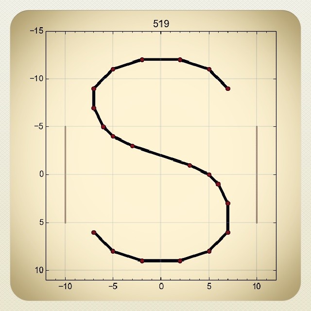
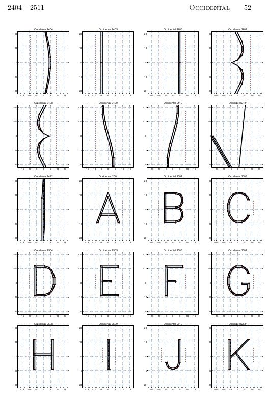
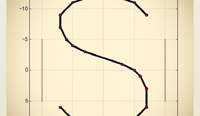
I’ve been playing with the Hershey Fonts, vector data digitised by the US government in 1967. It’s in a bit of a bear of a format.
I hope to do more fun stuff with the data. For now, here’s an 120 page sample book showing all the characters:
I’ve been playing with the Hershey Fonts, vector data digitised by the US government in 1967. It’s in a bit of a bear of a format.
I hope to do more fun stuff with the data. For now, here’s an 120 page sample book showing all the characters:
 If you’re wondering why the lower line has a load of squigglies when it appears identical to the one above, open the linked PDF and copy some of the text. Looks a bit squiffy, no?
I’m messing with your head here by splitting the encoding of the characters from the appearance of the glyphs, and using the old rot13 cypher to do it. This will really mess up the new MS Office “Edit PDF as text” schtick. Please note I’m doing this for lulz, not to break accessibility; that would be as the kids today say, a dick move.
Here’s the font: TimesNewROT13.
Since Times is both New and Roman, I thought I’d add some old roman by making a Caesar Cypher version. I don’t think I’ve done this quite right, but it works if you use the following shell command as an encoder:
tr '[A-C][D-Z][a-c][d-z]' '[D-Z][A-C][d-z][a-c]'
Here it is: TimesNewCaesar. I’ll fix it soon enough.
(Note that ROT13 fonts have been done before …)
I like epost. I’d like it even more if they hurried up and processed my direct payment ability — which required a form and a void cheque mailed to an address in Toronto — but it’s a pretty good service. I get my bills, viewable and payable online, on the day of issue. No paper. This is good.
This is good because every single filing container I buy eventually ends up full of (paid) bills and financial administrivia. Less paper = less messy Stewart = happy Stewart. Some messes, like my electronics table, could be classed as glorious, however, and therefore joyous in their creation and use. Not all tidiness is good.
So I got my first Visa bill by e-post. Yay! Reviewed it, paid it. No hassle. But since this a PDF facsimile of my bill, something mighty odd has happened to my address:
 It’s a perfect substitution cypher of my name and address. I’ve been out of the prepress industry for long enough not to immediately recognize it as a font encoding error. I’m confused why it might have A, T, E & N, but no M. Odd indeed.
For a reason best known to the Unicode consortium, there is now the symbol U+1F4A9 “Pile of Poo”: 💩. If you happen to create a web page with this delightful character in the title, Firefox does something special:
![]() Yep, that’s a smiley face poo, a bit like Mr Hankey. Oh dear.
Yep, that’s a smiley face poo, a bit like Mr Hankey. Oh dear.
Actually, it seems it might be an OS X Emoji thing, because Safari renders it in the title like that, and in the text as (enlarged to show texture):
 iOS has it covered too:
 Blackberry’s browser just shows a small black square. Android, rather sensibly, shows an empty square. It must be an Apple thing.
“Thanks†go to tchrist‘s comment in unicode – Why does modern Perl avoid UTF-8 by default? for alerting me to this character, and letting us know about the Symbola font that supports it. Yeah, cheers Tom …
Ecofont claims to help you save ink (and not mass, like drilled out bike bits). The approach is the same:
 Both of my printers have ink-saving settings that avoid this horror. Plus, y’know, with print to PDF, who wants paper?
I took the glyphs of an overused generic font, and subjected them repeatedly to the modern equivalent of stereotyping: rasterized them, then autotraced the bitmaps. As a side effect, all the character heights were lost, so everything’s the same size.
 Truetype: MeltdownHorrid.zip
 Truetype font: PoorFish.zip.
This is the first one I’ve done that hasn’t needed a printer or scanner. I exported the template to a single image (chargrid.png), then hand-wrote the characters using my graphics tablet on a new transparent layer in Gimp.
This isn’t quite right yet – characters aren’t encoded correctly, and it’s not quite as monospaced as it should be, but it has some nostalgia value. It’s the screen font used by the Amstrad CPC.

Font: CPC-0.9.zip
 File: AtkNoise. Probably best at as a display font.
(The name’s from the process I used to make the font. I masked the font over greyscale noise at fairly low resolution, then applied Atkinson dithering, then fed the result through potrace. I’ve used this technique before.)
Hey, this post is super old!
That means that installation and run instructions may not work as well, or even at all. Most of the *Ports Apple software repositories have given way to Homebrew: you may have some success on Mac (untested by me) if you brew install netpbm fontforge potrace. There’s also some font cleanup I’d recommend, like resolving overlaps, adding extrema, and rounding points to integer. One day I may update this post, but for now, I’m leaving it as is.
This looks more than a bit like my handwriting

because it is my handwriting! Sure, the spacing of the punctuation needs major work, and I could have fiddled with the baseline alignment, but it’s legible, which is more than can usually be said of my own chicken-scratch.
This process is a little fiddly, but all the parts are free, and it uses free software. This all runs from the command line. I wrote and tested this on a Mac (with some packages installed from DarwinPorts), but it should run on Linux. It might need Cygwin under Windows; I don’t know.
Software you will need:
You will need to download
Procedure:
 I find it helpful at this stage to clean off any specks/macules. I also scale and threshold the image so I get a very dark image at 300-600dpi.
fonttrace.pl infile.pbm | sh


There are a couple of limitations to the process:
Lastly, a couple of extra files:
Have fun! Write nicely!
Yes, it’s nonsense:

But I made these character glyphs in a semi-automatic bitmap converter for tracing in scanned letters into FontForge. It’s currently only a proof of concept, but I want to expand it up to a full ASCII font, at least.

Well, yes, according to YourFonts.com. You write into a special template, scan it, upload it to their website, add your signature and bank details, and you get a TTF of what you wrote. Next time, I’ll be a bit more careful with baseline alignment.
I might mess with the alignment and kerning in FontForge, but otherwise I like it.
(via Cool Tools)
I can’t believe I had difficulty with this one for so long:
 =MOD(450-angle,360)
This assumes you’re measuring the angle in the usual Cartesian way; anticlockwise from the x-axis.
Every couple of months, the Council of Canadians sends me a large and visually unappealing (1986 called; they want their typewriter font back) mailing, ranting about how those pesky Americans keep stealing our water.
Close reading of the mailing (which is hard, given the woeful typography) shows that the initiatives being railed at are either:
Like most environmental things, Canada has an appalling record of looking after its abundant water. I think we think that the rest of the world thinks better of us than they do, or maybe even frankly cares about Canada.
I’m a bit worried by the CoC’s use of the n-word — nationalist — since it has unpleasant connotations, like the BNP and SNLA. Also, at least half of the mailing could be summed up as The Maude Barlow Fanzine, with only slightly lower production quality than the average zine.
And anyway, pesky Americans haven’t been stealing our water. Catherine hasn’t been sneaking any more out of the house than usual …


 Truetype:
