1 2 3 4 5 6 7 8 9 0
A B C D E F G H I J K L M N O P Q R S T U V W X Y Z
⑀ ⑁ ⑂ + - . / $ < > " , ¥
Lower case character glyphs are duplicates of upper case ones, although this is outside the X3.111-1986 standard.
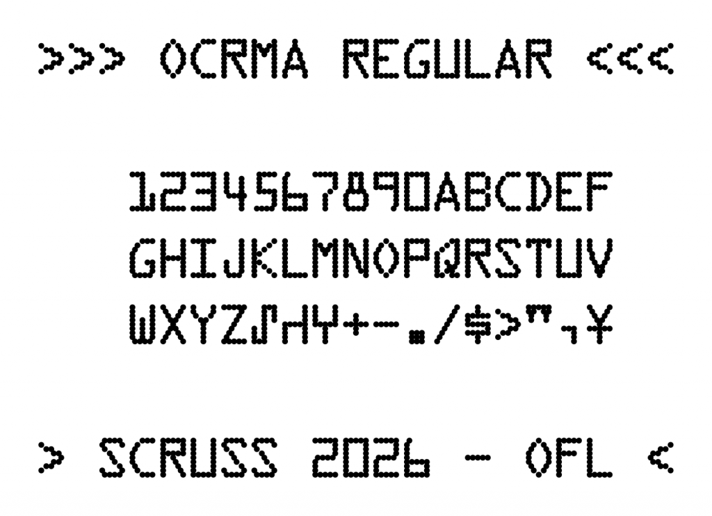
Design Size
The 12 point design size is meant to reproduce 12 characters per inch horizontally, and six lines per inch vertically. OCR standards of 1986 suggested three lines per vertical inch, which can be achieved by double spacing.
Source
While this font is produced entirely by one Python FontForge script, the code is too ugly for you to look at. The included OCRmA.json is likely more useful: it contains all of the pin definitions keyed by character name.
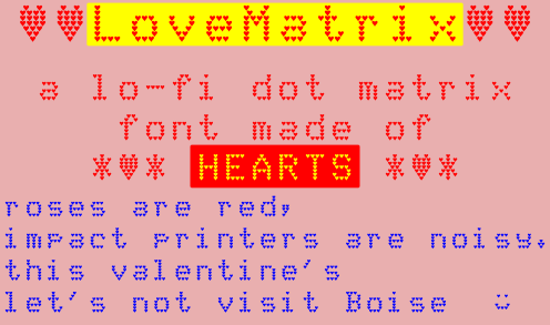
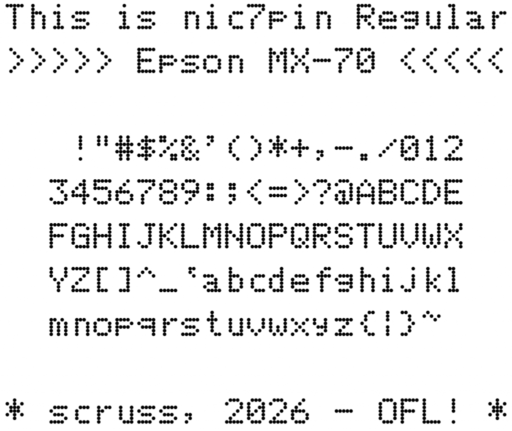
Seiko Epson Corporation is named as “son of EP-101”, for the world’s first compact, lightweight digital printer. I’m Scottish, and in Scots Gaelic “son of” is mac. Unfortunately, that prefix has been co-opted by an overpriced computer vendor. In Gaelic, nic means “daughter of”, so as an oblique compliment to Epson, this font is named daughter of 7 pin. It seemed like a good idea at the time …
Coverage
ASCII.
Design Size
The 12 point design size is meant to reproduce 12 characters per inch horizontally, and six lines per inch vertically.
Source
While this font is produced entirely by one Python FontForge script, the code is too ugly for you to look at. The included mx70.json is likely more useful: it contains all of the pin definitions keyed by character name.
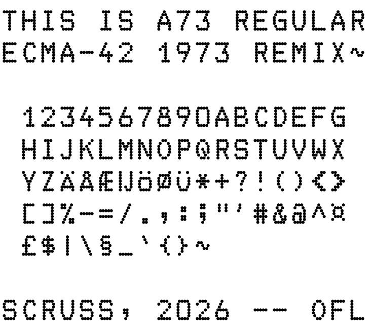
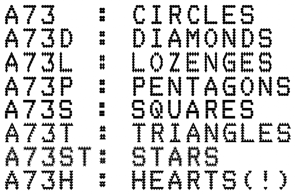
While this font is produced entirely by one Python FontForge script, the code is too ugly to include here. The included a73.json is likely more useful: it contains all of the pin definitions keyed by character name.
ASCII, mostly. The standard did not provide definitions for these characters:
U+005F _ LOW LINE
U+0060 ` GRAVE ACCENT
U+007B { LEFT CURLY BRACKET
U+007D } RIGHT CURLY BRACKET
U+007E ~ TILDE
As this is an attempt to faithfully implement a standard, these characters were not synthesized. In a slight concession to modernity, glyphs for A–Z have been copied to a–z.
The standard also defines the following extended characters:
U+00A4 ¤ CURRENCY SIGN
U+00A3 £ POUND SIGN
U+00C6 Æ LATIN CAPITAL LETTER AE
U+00C5 Å LATIN CAPITAL LETTER A WITH RING ABOVE
U+00C4 Ä LATIN CAPITAL LETTER A WITH DIAERESIS
U+00A7 § SECTION SIGN
U+0132 IJ LATIN CAPITAL LIGATURE IJ
U+00D6 Ö LATIN CAPITAL LETTER O WITH DIAERESIS
U+00D8 Ø LATIN CAPITAL LETTER O WITH STROKE
U+00DC Ü LATIN CAPITAL LETTER U WITH DIAERESIS
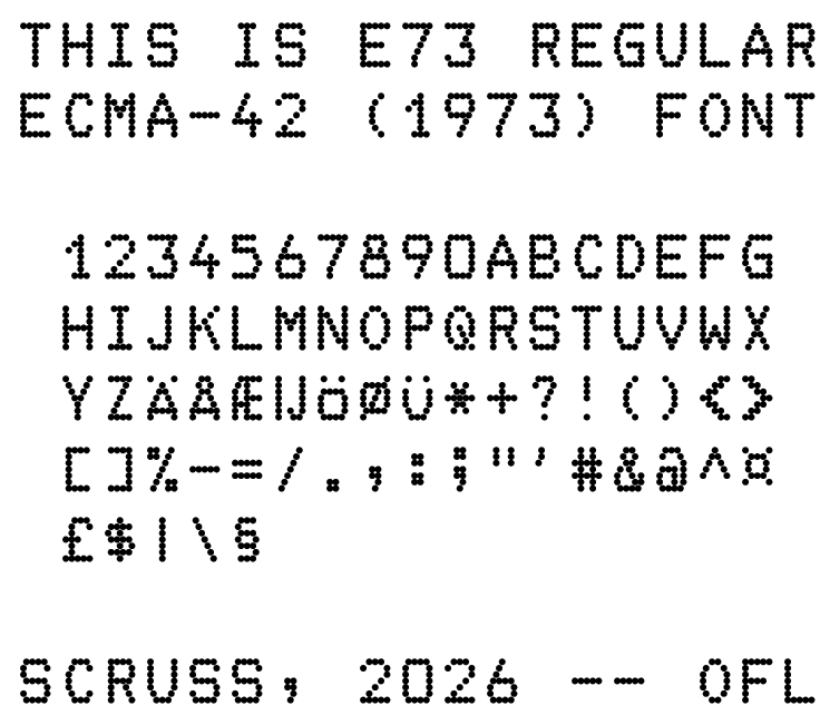
Design Size
The 12 point design size is meant to reproduce 10 characters per inch horizontally, and six lines per inch vertically. This is a requirement of the standard to match OCR fonts of the day.
Variants
None. This is an attempt to reproduce the character forms exactly according to the standard document.
Source
While this font is produced entirely by one Python FontForge script, the code is too ugly to include here. The included ecma42.json is likely more useful: it contains all of the pin definitions keyed by character name.
First PostScript font: STSong (华文宋体) was released in 1991, making it the first PostScript font by a Chinese foundry [ref: Typekit blog — Pan-CJK Partner Profile: SinoType]. But STSong looks like Garamond(ish).
Oooh blecch — did I really like this when I was a young ‘un? Following on from the same process as in The coolest font (when I was 15, that is) here’s the bitmap font from Level 9’s Snowball.
 10 REM    *** L9SFONT.BAS ***
 15 REM bitmap font from Level 9's
 20 REM Snowball text adventure
 30 REM  on the Amstrad CPC 464
 40 REM (it was so cool at the time ...)
 50 REM Dug up by scruss, 2020-01
 60 REM ==============================
 100 SYMBOL AFTER 32
 110 MODE 1
 120 GOSUB 1000
 130 PRINT" *** It's the Level 9 font ***"
 140 PRINT" ***    from  Snowball!    ***"
 150 PRINT"   Dug up by scruss, 2020-01"
 160 PRINT
 170 PEN 2
 180 PRINT"Lorem ipsum dolor sit amet, consectetur"
 190 PRINT"adipiscing elit, sed do eiusmod tempor"
 200 PRINT"incididunt ut labore et dolore magna"
 210 PRINT"aliqua. Ut enim ad minim veniam, quis"
 220 PRINT"nostrud exercitation ullamco laboris"
 230 PRINT"nisi ut aliquip ex ea commodo consequat"
 240 PRINT"arfle barfle gloop? | | |"
 250 PRINT
 260 PEN 1
 270 FOR i%=32 TO 127
 280 PRINT CHR$(i%); " ";
 290 NEXT i%
 300 PRINT
 310 PRINT
 990 END
 1000 SYMBOL 33,&10,&28,&28,&28,&10,0,&38,0
 1010 SYMBOL 34,&66,&66,&44,&88,0,0,0,0
 1020 SYMBOL 35,0,&24,&7e,&24,&24,&7e,&24,0
 1030 SYMBOL 36,&10,&7c,&40,&7c,&04,&7c,&10,0
 1040 SYMBOL 37,&e4,&a4,&e8,&10,&2e,&4a,&4e,0
 1050 SYMBOL 38,&70,&88,&88,&72,&84,&88,&76,0
 1060 SYMBOL 39,&0c,&0c,&08,&10,0,0,0,0
 1070 SYMBOL 40,&0c,&10,&30,&30,&20,&14,&0c,0
 1080 SYMBOL 41,&30,&28,&04,&0c,&0c,&08,&30,0
 1090 SYMBOL 42,&10,&54,&38,&fe,&38,&54,&10,0
 1100 SYMBOL 43,0,&10,&10,&7c,&10,&10,0,0
 1110 SYMBOL 44,0,0,0,0,&18,&18,&10,&20
 1120 SYMBOL 45,0,0,0,&fc,0,0,0,0
 1130 SYMBOL 46,0,0,0,0,&1c,&14,&1c,0
 1140 SYMBOL 47,0,&06,&0e,&08,&10,&70,&60,0
 1150 SYMBOL 48,&fc,&8c,&8c,&84,&c4,&c4,&fc,0
 1160 SYMBOL 49,&30,&10,&10,&10,&18,&18,&38,0
 1170 SYMBOL 50,&f8,&98,&08,&f8,&80,&c8,&f8,0
 1180 SYMBOL 51,&7c,&64,&04,&3c,&34,&04,&7c,0
 1190 SYMBOL 52,&c8,&88,&88,&f8,&08,&18,&18,0
 1200 SYMBOL 53,&f8,&98,&80,&f0,&08,&c8,&f0,0
 1210 SYMBOL 54,&78,&98,&80,&f8,&98,&c8,&f8,0
 1220 SYMBOL 55,&fc,&c4,&04,&08,&08,&18,&18,0
 1230 SYMBOL 56,&fc,&c4,&8c,&fc,&84,&9c,&fc,0
 1240 SYMBOL 57,&fc,&e4,&84,&fc,&04,&0c,&0c,0
 1250 SYMBOL 58,&38,&28,&38,0,&38,&28,&38,0
 1260 SYMBOL 59,&18,&18,0,&18,&18,&10,&20,0
 1270 SYMBOL 60,&04,&08,&10,&20,&10,&08,&04,0
 1280 SYMBOL 61,0,0,&7e,0,&7e,0,0,0
 1290 SYMBOL 62,&80,&40,&20,&10,&20,&40,&80,0
 1300 SYMBOL 63,&7c,&04,&1c,&10,&10,0,&10,0
 1310 SYMBOL 64,&3e,&22,&2e,&2a,&2e,&20,&3e,0
 1320 SYMBOL 65,&fc,&c4,&8c,&fc,&84,&c4,&c4,0
 1330 SYMBOL 66,&f8,&84,&e4,&f8,&84,&9c,&f8,0
 1340 SYMBOL 67,&fc,&8c,&80,&80,&c0,&c4,&fc,0
 1350 SYMBOL 68,&f8,&64,&64,&44,&4c,&4c,&f8,0
 1360 SYMBOL 69,&fc,&8c,&c0,&f8,&c0,&8c,&fc,0
 1370 SYMBOL 70,&fc,&9c,&80,&f8,&80,&c0,&c0,0
 1380 SYMBOL 71,&fc,&9c,&80,&9c,&c4,&c4,&fc,0
 1390 SYMBOL 72,&c4,&c4,&84,&fc,&84,&8c,&8c,0
 1400 SYMBOL 73,&7c,&14,&10,&10,&10,&50,&7c,0
 1410 SYMBOL 74,&7c,&54,&10,&18,&18,&90,&60,0
 1420 SYMBOL 75,&c8,&90,&a0,&d0,&88,&8c,&8c,0
 1430 SYMBOL 76,&c0,&c0,&c0,&80,&80,&98,&f8,0
 1440 SYMBOL 77,&82,&ee,&92,&92,&ba,&82,&c6,0
 1450 SYMBOL 78,&8c,&c4,&c4,&b4,&8c,&8c,&84,0
 1460 SYMBOL 79,&fc,&c4,&c4,&84,&8c,&8c,&fc,0
 1470 SYMBOL 80,&fc,&c4,&8c,&fc,&80,&c0,&c0,0
 1480 SYMBOL 81,&fc,&c4,&c4,&84,&94,&88,&f4,0
 1490 SYMBOL 82,&fc,&c4,&8c,&fc,&90,&c8,&cc,0
 1500 SYMBOL 83,&fc,&84,&80,&78,&04,&84,&fc,0
 1510 SYMBOL 84,&7c,&10,&10,&10,&30,&30,&30,0
 1520 SYMBOL 85,&c4,&c4,&84,&8c,&8c,&8c,&fc,0
 1530 SYMBOL 86,&c4,&84,&84,&48,&48,&30,&30,0
 1540 SYMBOL 87,&84,&84,&84,&b4,&b4,&cc,&84,0
 1550 SYMBOL 88,&cc,&cc,&48,&30,&48,&cc,&cc,0
 1560 SYMBOL 89,&86,&86,&44,&28,&10,&18,&18,0
 1570 SYMBOL 90,&fc,&84,&08,&30,&40,&84,&fc,0
 1580 SYMBOL 91,&7c,&60,&60,&40,&40,&4c,&7c,0
 1590 SYMBOL 92,0,&60,&30,&10,&08,&0c,&06,0
 1600 SYMBOL 93,&3e,&32,&02,&02,&06,&06,&3e,0
 1610 SYMBOL 94,&18,&24,&42,&42,0,0,0,0
 1620 SYMBOL 95,0,0,0,0,0,0,&ee,&bb
 1630 SYMBOL 96,&3c,&22,&78,&20,&78,&20,&7e,0
 1640 SYMBOL 97,0,0,&f8,&98,&88,&cc,&fc,0
 1650 SYMBOL 98,&80,&80,&f8,&98,&88,&c8,&f8,0
 1660 SYMBOL 99,0,0,&f8,&88,&c0,&c8,&f8,0
 1670 SYMBOL 100,&08,&08,&f8,&98,&88,&c8,&f8,0
 1680 SYMBOL 101,0,0,&f8,&80,&e0,&80,&f8,0
 1690 SYMBOL 102,0,&1c,&10,&38,&38,&10,&70,0
 1700 SYMBOL 103,0,0,&f8,&98,&88,&f8,&08,&78
 1710 SYMBOL 104,&c0,&c0,&80,&f8,&88,&cc,&cc,0
 1720 SYMBOL 105,0,&60,0,&60,&60,&70,&70,0
 1730 SYMBOL 106,&08,0,&18,&18,&08,&08,&68,&78
 1740 SYMBOL 107,&c0,&c0,&cc,&d8,&f0,&d8,&cc,0
 1750 SYMBOL 108,&30,&30,&30,&30,&30,&30,&30,0
 1760 SYMBOL 109,0,0,&cc,&b4,&b4,&84,&84,0
 1770 SYMBOL 110,0,0,&f8,&98,&88,&cc,&cc,0
 1780 SYMBOL 111,0,0,&f8,&98,&88,&c8,&f8,0
 1790 SYMBOL 112,0,0,&f8,&98,&88,&f8,&80,&80
 1800 SYMBOL 113,0,0,&f8,&88,&c8,&f8,&0c,&0c
 1810 SYMBOL 114,0,0,&f8,&98,&80,&c0,&c0,0
 1820 SYMBOL 115,0,0,&f8,&80,&70,&08,&f8,0
 1830 SYMBOL 116,&60,&60,&20,&78,&20,&28,&38,0
 1840 SYMBOL 117,0,0,&c8,&c8,&98,&98,&f8,0
 1850 SYMBOL 118,0,0,&cc,&cc,&88,&70,&20,0
 1860 SYMBOL 119,0,0,&84,&84,&b4,&b4,&cc,0
 1870 SYMBOL 120,0,0,&cc,&48,&30,&48,&cc,0
 1880 SYMBOL 121,0,0,&88,&c8,&f8,&08,&08,&78
 1890 SYMBOL 122,0,0,&f8,&90,&20,&48,&f8,0
 1900 SYMBOL 123,&0c,&30,&10,&60,&10,&30,&0c,0
 1910 SYMBOL 124,&df,&db,&db,&9f,&83,&9b,&fb,0
 1920 SYMBOL 125,&30,&0c,&08,&06,&08,&0c,&30,0
 1930 SYMBOL 126,&7c,&82,&ba,&a2,&ba,&82,&7c,0
 1940 SYMBOL 127,&FF,&FF,&FF,&FF,&FF,&FF,&FF,&FF
 1950 RETURN
Process was the same:
Load the disk image into an emulator
Load the game
Save the game as a v2 snapshot – these are uncompressed memory dumps
Though I didn’t really have the patience for text adventures, Level 9 used what I thought was the coolest font (circa 1985). After checking through them all on the Internet Archive Amstrad CPC software library, I couldn’t find a version that used this bitmap font. I eventually found it on nvg. After lots of messing about, I extracted it and present it here. I’m sure I’ll make a TTF of it soon enough.
Tastes change a bit, don’t they?
 10 REM     *** L9FONT.BAS ***
 15 REM bitmap font from Level 9's
 20 REM Colossal Cave adventure
 30 REM  on the Amstrad CPC 464
 40 REM (it was so cool at the time…)
 50 REM Dug up by scruss, 2019-12
 60 REM ==============================
 100 SYMBOL AFTER 32
 110 MODE 1
 120 GOSUB 1000
 130 PRINT" *** It's the Level 9 font ***"
 140 PRINT" ***  from Colossal Cave!  ***"
 150 PRINT"   Dug up by scruss, 2019-12"
 160 PRINT
 170 PEN 2
 180 PRINT"Lorem ipsum dolor sit amet, consectetur"
 190 PRINT"adipiscing elit, sed do eiusmod tempor"
 200 PRINT"incididunt ut labore et dolore magna"
 210 PRINT"aliqua. Ut enim ad minim veniam, quis"
 220 PRINT"nostrud exercitation ullamco laboris"
 230 PRINT"nisi ut aliquip ex ea commodo consequat"
 240 PRINT"arfle barfle gloop? | | |"
 250 PRINT
 260 PEN 1
 270 FOR i%=32 TO 127
 280 PRINT CHR$(i%); " ";
 290 NEXT i%
 300 PRINT
 310 PRINT
 990 END
 1000 SYMBOL 33,&18,&24,&24,&24,&18,&0,&18,&0
 1010 SYMBOL 34,&66,&66,&44,&88,&0,&0,&0,&0
 1020 SYMBOL 35,&0,&24,&7E,&24,&24,&7E,&24,&0
 1030 SYMBOL 36,&12,&7C,&D0,&7C,&16,&FC,&10,&0
 1040 SYMBOL 37,&E4,&A4,&E8,&10,&2E,&4A,&4E,&0
 1050 SYMBOL 38,&70,&D8,&D8,&72,&D6,&CC,&76,&0
 1060 SYMBOL 39,&30,&30,&20,&40,&0,&0,&0,&0
 1070 SYMBOL 40,&1C,&38,&70,&70,&70,&38,&1C,&0
 1080 SYMBOL 41,&70,&38,&1C,&1C,&1C,&38,&70,&0
 1090 SYMBOL 42,&10,&54,&38,&FE,&38,&54,&10,&0
 1100 SYMBOL 43,&0,&10,&10,&7C,&10,&10,&0,&0
 1110 SYMBOL 44,&0,&0,&0,&0,&30,&30,&20,&40
 1120 SYMBOL 45,&0,&0,&0,&F8,&0,&0,&0,&0
 1130 SYMBOL 46,&0,&0,&0,&0,&0,&60,&60,&0
 1140 SYMBOL 47,&0,&4,&8,&10,&20,&40,&0,&0
 1150 SYMBOL 48,&7C,&C6,&CE,&D6,&E6,&C6,&7C,&0
 1160 SYMBOL 49,&8,&18,&38,&18,&18,&18,&3C,&0
 1170 SYMBOL 50,&3C,&66,&C,&18,&30,&62,&7E,&0
 1180 SYMBOL 51,&7E,&4C,&18,&3C,&6,&66,&3C,&0
 1190 SYMBOL 52,&4,&C,&1C,&2C,&7E,&C,&1E,&0
 1200 SYMBOL 53,&3E,&66,&60,&7C,&6,&6,&7C,&0
 1210 SYMBOL 54,&3C,&66,&60,&7C,&66,&66,&3C,&0
 1220 SYMBOL 55,&7E,&46,&6,&C,&C,&18,&18,&0
 1230 SYMBOL 56,&3C,&66,&34,&18,&2C,&66,&3C,&0
 1240 SYMBOL 57,&3C,&66,&66,&3E,&6,&66,&3C,&0
 1250 SYMBOL 58,&0,&30,&30,&0,&0,&30,&30,&0
 1260 SYMBOL 59,&0,&30,&30,&0,&30,&30,&20,&40
 1270 SYMBOL 60,&1C,&30,&60,&C0,&60,&30,&1C,&0
 1280 SYMBOL 61,&0,&0,&F8,&0,&F8,&0,&0,&0
 1290 SYMBOL 62,&E0,&30,&18,&C,&18,&30,&E0,&0
 1300 SYMBOL 63,&7C,&64,&C,&18,&10,&0,&10,&0
 1310 SYMBOL 64,&7C,&C6,&DE,&D2,&DE,&C0,&7E,&0
 1320 SYMBOL 65,&18,&6C,&C6,&C6,&FE,&66,&F6,&0
 1330 SYMBOL 66,&FC,&C6,&C6,&FC,&C6,&C6,&FC,&0
 1340 SYMBOL 67,&3C,&66,&C0,&C0,&C0,&66,&3C,&0
 1350 SYMBOL 68,&D8,&EC,&C6,&C6,&C6,&EC,&D8,&0
 1360 SYMBOL 69,&FE,&62,&60,&78,&60,&62,&FE,&0
 1370 SYMBOL 70,&FE,&62,&60,&78,&60,&60,&E0,&0
 1380 SYMBOL 71,&3C,&66,&C0,&CE,&C6,&66,&3C,&0
 1390 SYMBOL 72,&C6,&C6,&C6,&FE,&C6,&C6,&C6,&0
 1400 SYMBOL 73,&7E,&18,&18,&18,&18,&18,&7E,&0
 1410 SYMBOL 74,&FE,&8C,&C,&C,&C,&CC,&78,&0
 1420 SYMBOL 75,&E6,&CC,&D8,&F0,&D8,&CC,&C6,&0
 1430 SYMBOL 76,&E0,&C0,&C0,&C0,&C0,&C2,&FE,&0
 1440 SYMBOL 77,&C6,&EE,&FE,&D6,&C6,&C6,&CC,&0
 1450 SYMBOL 78,&CE,&E6,&F6,&DE,&CE,&C6,&C6,&0
 1460 SYMBOL 79,&38,&6C,&C6,&C6,&C6,&6C,&38,&0
 1470 SYMBOL 80,&DC,&E6,&C6,&C6,&FC,&C0,&C0,&0
 1480 SYMBOL 81,&38,&6C,&C6,&C6,&CA,&64,&3A,&0
 1490 SYMBOL 82,&DC,&E6,&C6,&C6,&FC,&CC,&C6,&0
 1500 SYMBOL 83,&7C,&C6,&C0,&7C,&6,&C6,&7C,&0
 1510 SYMBOL 84,&FE,&B2,&30,&30,&30,&30,&30,&0
 1520 SYMBOL 85,&E6,&66,&C6,&C6,&C6,&C6,&7C,&0
 1530 SYMBOL 86,&E6,&66,&C6,&C6,&CC,&78,&30,&0
 1540 SYMBOL 87,&EC,&66,&C6,&C6,&D6,&D6,&6C,&0
 1550 SYMBOL 88,&EE,&C6,&6C,&38,&6C,&C6,&EE,&0
 1560 SYMBOL 89,&EE,&C6,&2C,&18,&18,&18,&18,&0
 1570 SYMBOL 90,&FE,&8C,&18,&30,&60,&C2,&FE,&0
 1580 SYMBOL 91,&7C,&64,&60,&60,&60,&60,&7C,&0
 1590 SYMBOL 92,&0,&60,&30,&10,&8,&C,&6,&0
 1600 SYMBOL 93,&3E,&6,&6,&6,&6,&26,&3E,&0
 1610 SYMBOL 94,&18,&24,&42,&42,&0,&0,&0,&0
 1620 SYMBOL 95,&0,&0,&0,&0,&0,&0,&EE,&BB
 1630 SYMBOL 96,&3C,&22,&78,&20,&78,&20,&7E,&0
 1640 SYMBOL 97,&0,&0,&74,&DC,&C4,&CC,&74,&0
 1650 SYMBOL 98,&C0,&C0,&DC,&E6,&C6,&E6,&DC,&0
 1660 SYMBOL 99,&0,&0,&78,&CC,&C0,&CC,&78,&0
 1670 SYMBOL 100,&0,&70,&18,&7C,&CC,&CC,&78,&0
 1680 SYMBOL 101,&0,&0,&78,&CC,&FC,&C0,&7C,&0
 1690 SYMBOL 102,&68,&74,&60,&F8,&60,&60,&60,&C0
 1700 SYMBOL 103,&0,&0,&78,&CC,&C0,&CC,&7C,&C
 1710 SYMBOL 104,&C0,&C0,&D8,&EC,&CC,&D8,&DC,&0
 1720 SYMBOL 105,&C,&0,&38,&18,&18,&18,&38,&0
 1730 SYMBOL 106,&6,&0,&1C,&C,&C,&C,&4C,&38
 1740 SYMBOL 107,&C0,&C0,&CC,&D8,&F0,&D8,&CE,&0
 1750 SYMBOL 108,&30,&30,&30,&30,&30,&36,&3E,&0
 1760 SYMBOL 109,&0,&0,&AC,&D6,&D6,&C6,&CC,&0
 1770 SYMBOL 110,&0,&0,&BC,&C6,&C6,&CC,&DE,&0
 1780 SYMBOL 111,&0,&0,&7C,&C6,&C6,&C6,&7C,&0
 1790 SYMBOL 112,&0,&0,&DC,&E6,&C6,&E6,&DC,&C0
 1800 SYMBOL 113,&0,&0,&76,&CE,&C6,&CE,&76,&6
 1810 SYMBOL 114,&0,&0,&DC,&E6,&C6,&FC,&C6,&0
 1820 SYMBOL 115,&0,&0,&3C,&60,&3C,&8E,&7C,&0
 1830 SYMBOL 116,&18,&30,&FC,&30,&30,&32,&1C,&0
 1840 SYMBOL 117,&0,&0,&E6,&66,&C6,&C6,&7A,&0
 1850 SYMBOL 118,&0,&0,&EC,&66,&C6,&EC,&38,&0
 1860 SYMBOL 119,&0,&0,&EC,&C6,&D2,&7C,&28,&0
 1870 SYMBOL 120,&0,&0,&EE,&6C,&38,&6C,&EE,&0
 1880 SYMBOL 121,&0,&0,&EC,&C6,&6C,&18,&30,&E0
 1890 SYMBOL 122,&0,&0,&FE,&9C,&30,&62,&FE,&0
 1900 SYMBOL 123,&C,&30,&30,&60,&30,&30,&C,&0
 1910 SYMBOL 124,&CF,&DB,&DB,&CF,&C3,&DB,&FB,&0
 1920 SYMBOL 125,&60,&18,&18,&C,&18,&18,&60,&0
 1930 SYMBOL 126,&7C,&C6,&BA,&A2,&BA,&C6,&7C,&0
 1940 SYMBOL 127,&FF,&FF,&FF,&FF,&FF,&FF,&FF,&FF
 1950 RETURN
The 029 (as it is sometimes known) generated a bitmap font from an engraved metal plate pressing on a matrix of pins. A picture of this plate from a field engineering manual was used to re-create the pin matrices, and thus an outline font.
029 Code Plate029 Code Key
Historical Accuracy
The 029 could have many different code plates, but the one used here contained the characters:
The character glyphs have been sized such that if printed at 12 points, the 029’s character pitch of 0.087″ is accurately reproduced. No attempt to research the pin matrix pitch or pin diameter has been made: the spacing was eyeballed from a couple of punched cards in my collection.
The earlier IBM Type 26 Card Punch (“026”) included a glyph for a square lozenge (Unicode U+2311, ⌑). The 029 code plate did not include this character, but I added it here for completeness.
The character set was extended to include:
all of ASCII, with lower case characters repeating the upper case glyphs;
sterling currency symbol; and
euro currency symbol.
While there may have been official IBM renditions of some of these additional glyphs (with the exception of euro) no attempt has been made to research the original shapes. This font set is intended to help with the visually accurate reproduction of 1960s-era punched cards, mostly coinciding with my interest in the FORTRAN programming language. No attempt has been made to use historical BCD/EBCDIC encodings in these fonts. We have Unicode now.
The 029 card punch could not produce any bold or italic font variants, but FontForge can, so I did.
Things I learned in making these fonts
The 029 card punch printer could be damaged if you tried to print binary cards, as there was no way to disengage the code plate from the punch mechanism.
FontForge really hates to have paths in a glyph just touching. Either keep them more than one unit apart, or overlap them and merge the overlapping paths.
EBCDIC is weird.
Sources
Norbert Landsteiner’s amazing Punched Card Typography Explained page describes how the code plate system worked, and has JavaScript animations showing how characters were decoded (entirely mechanically) from the plate.
Full Language Support: Afrikaans, Baltic, Basic Latin, Catalan, Central European, Dutch, Esperanto, Euro, Turkish, Western European. Terrible kerning comes free.
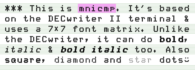
I just made and uploaded this to FontLibrary: mnicmp.
This is meant more as an exercise in learning FontForge‘s programming back-end, and definitely showed me that FontForge is incredibly powerful. After the learning comes silliness, so I ended up turning the dots into something like:
I learned you really have to consider a dot-matrix font to be an array of points rather than a glyph, because otherwise you get the dots coming out the wrong sort of oval:
Blue font has been italicized as a whole, while the black dots were done properly
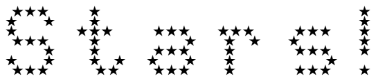
You don’t want to know what it did to the stars …
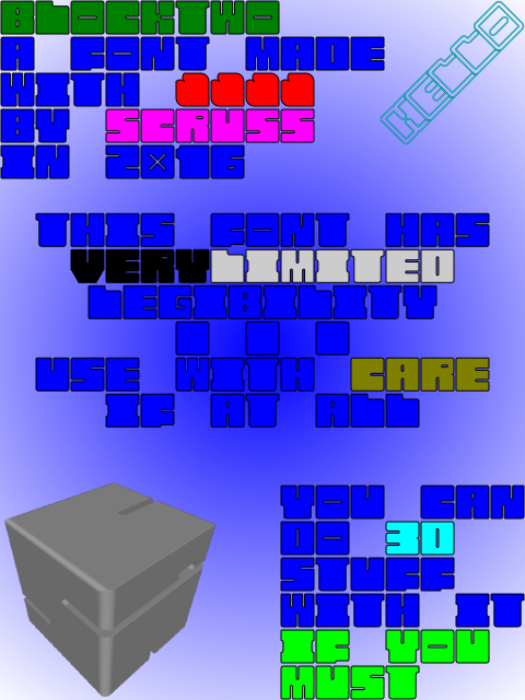
BlockTwo is a spectacularly ugly font mostly for playing about with 3D intersections in OpenSCAD. Not recommended for any but the most extreme display usage. Coverage is only A-Z caps, 0-9, heart and block.
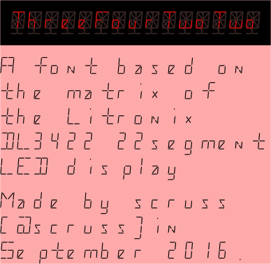
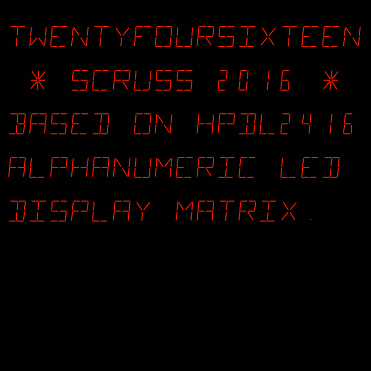
Yup, another highly impractical monospaced font. This one is based on a short-lived 22 segment display made in the early 1980s by Litronix (datasheet).
A mono-spaced font family derived from the HP/Siemens/Litronix DL-2416 17-segment alphanumeric 17 segment LED display matrix.
Design size: appx 19 pt
For maximum fidelity, should be displayed/printed red to match the original’s ~640 nm wavelength. This corresponds to RGB #ff2100
Weights
Regular only.
Note that this has a very slight skew (5°) built in.
Coverage
ASCII only, upper case.
Author
Stewart C. Russell – http://scruss.com/blog/
Licence
Dual-licensed CC0/WTFPL (srsly)
All of the segments. I’ve stashed this glyph at character code U+007f so you can make up new ones.
also: numbers.zip — just 00-99 as PNG images, after this, made with Pango, like this:
for f in {00..99}
do
 pango-view --no-display --background=black --dpi=112 --align=right --foreground='#ff2100' --font='TwentyfourSixteen Regular 48' --hinting=full --output="$f.png" -t "$f"
done
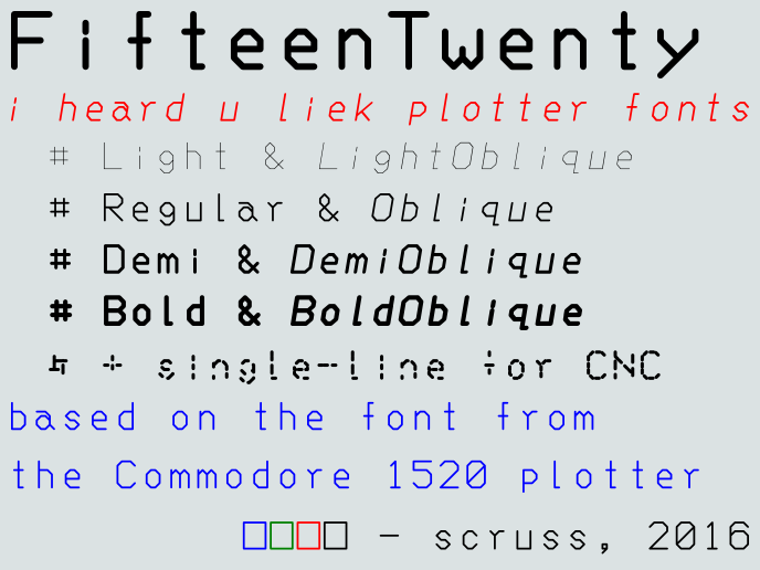
Following on from FifteenTwenty, I made a hairline/single stroke version of the font especially for CNC use. This is a slight misuse of the OpenType format, but if you’re plotting/CNCing/laser cutting, the filled paths of standard fonts don’t work so well. Single-line (or stroke) fonts used to be possible in PostScript — the version of Courier shipped with early Apple LaserWriter printers was composed of strokes, rather than filled paths — but have fallen out of favour. If you have a device with a defined tool width, it’s better to let the tool make the width of the mark/cut. Here’s the hairline font plotted with a 0.7 mm pen to illustrate what I mean:
This font is almost invisible on screen or on a regular printer, so I don’t recommend installing it unless you have specific CNC/plotting needs. Please note that the font will cause your device to follow the tool path of each letter twice.
It’s impractically huge, but under the image link lives a table of all of the Hershey fonts (well, the Western ones, at least). It’s interesting to note Dr Hershey’s preferences in this pre-ASCII table: almost every variant has degree, minute and second symbols, but none of them have ‘\’. Many of them don’t have ‘@’, either, so no e-mail addresses in Hershey Fraktur for you …
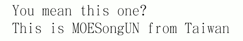
![A table of the latin characters @, A-Z, [, \, ], ^, _, `, a-z and { in STSong half-width latin, taken from fontforge](https://scruss.com/wordpress/wp-content/uploads/2024/01/Screenshot-from-2024-01-07-11-44-09.png)