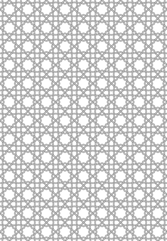
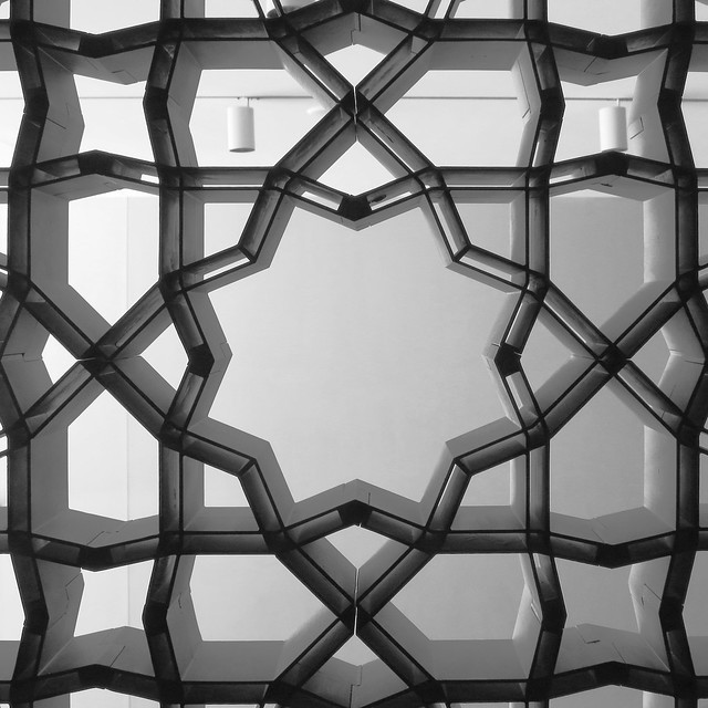
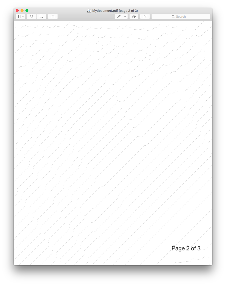
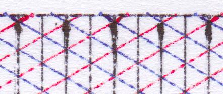
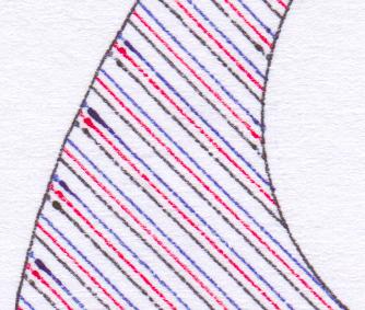
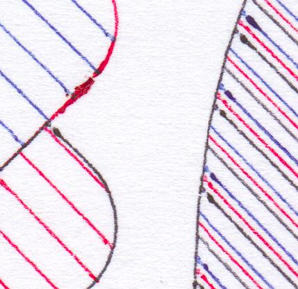
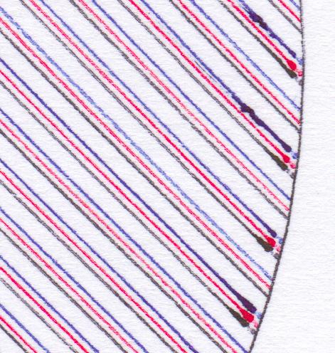
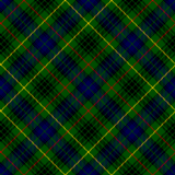
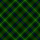
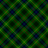
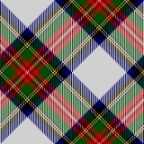
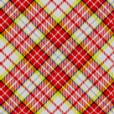
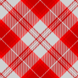
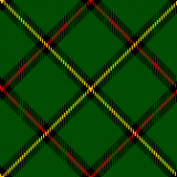
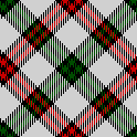
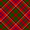
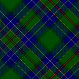
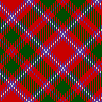
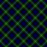
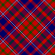
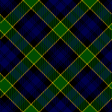
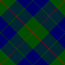
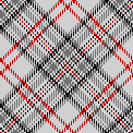
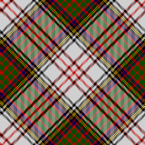
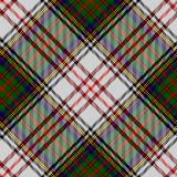
I’m rather pleased with this, as it’s the first pattern I’ve worked out from a real example, a screen in the Aga Khan Museum:
Here’s the pattern as a full page PDF from Inkscape: akm-screen-tiled-strapwork.pdf. The pattern’s not much more than an 8-pointed star with a smaller 8-pointed star inside it, rotated 22½°. But it’s still kinda neat.
Summary: Buy the paper edition; this book is illegible on Kindle.
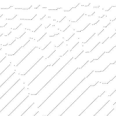
The original book features very finely engraved line drawings, with construction lines showing how the patterns are built up. The Kindle edition has only low-resolution scans, so the lines break down into noise and are very hard to follow. You can’t zoom in, either. The figure numbering is entirely absent from the Kindle edition, so you can’t use this book for reference. Some of the page scans are squint and partially cut off, too.
Very disappointed in this purchase. You’re better off with the paper than trying to squint at these smudgy pixels.
(unedited text as simultaneously posted to Amazon)
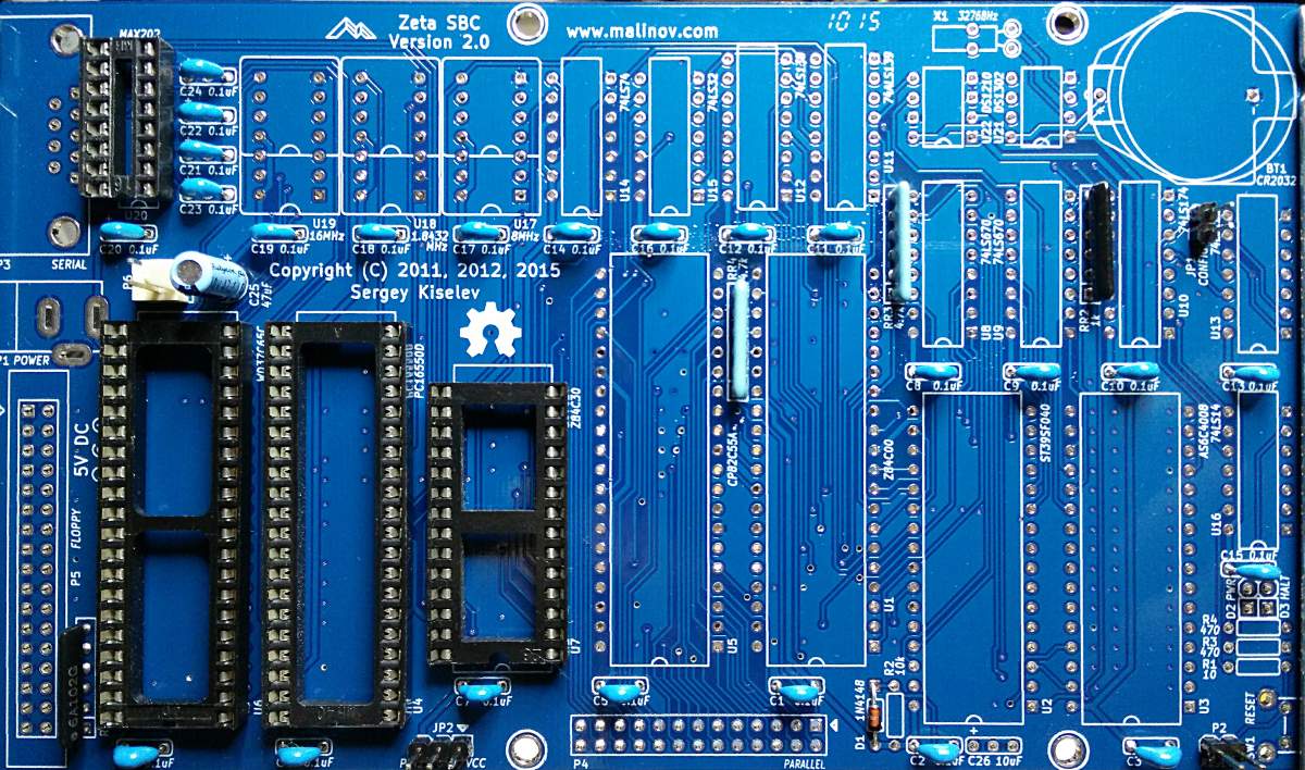
That’s all but one of the capacitors in. The big chip sockets are soothing to solder.
Apart from the bits I got in a frantic dash between Supremetronics and Creatron on College, the rest is coming from Mouser. Taking the advice of someone who should know better, I’ve ordered a made-in-DDR UA857D MME chip, since Z80 CTCs are back ordered. Sometimes, it’s good to have chips older than your colleagues …
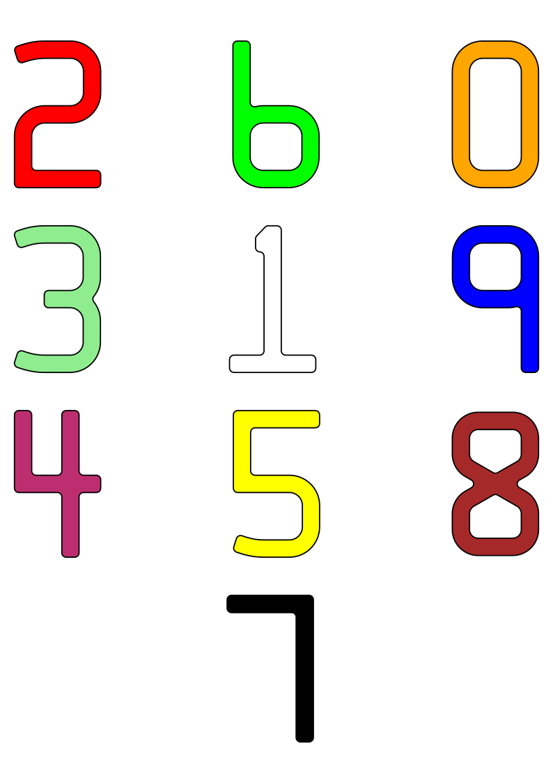
A minimally-useful tracing of the standard numerals embossed
on credit cards. The geometry should be checked against ISO/IEC 7811—1:2002 should these data be used for official purposes. No claims of compliance are made here.
As there are only 10 digits in this font, encoding it as a digital
form (TTF, OTF, or otherwise) is left as an exercise for the reader.
Files
f7b-colour.svg – an A4 sheet with all 10 digits presented as a
poster. Each digit is approximately 1284% standard size.
eps folder – PostScript source files. Each outline is approximately 5695% standard size, which is appropriate for a glyph in FontForge.
Workflow
The rough character outlines were created as short scripts in Python,
using the Shapely library to handle geometry. A confusing array of support tools (including, but not limited to: QCAD, wellknown
and OGR added the arcs and fillets. The more complex arc intersections were calculated using GeoGebra. Finally, the
outlines — at this point, mostly in the form of PostScript Level 2 arct commands — were hand-keyed into the EPS files included here.
Notes on the data
There are some typos in the published coordinates, particularly in
the “1” glyph. Whether these are genuine errors or
‘trap streets‘, is hard to tell. The glyphs presented here are intended to be visually accurate
The published coordinates of the “8” glyph indicate that it is
only 97.6% as tall as the other digits. This has been carried
through here.
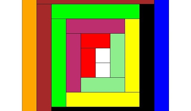
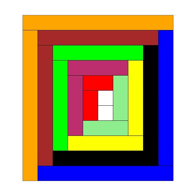
Rods! Or more specifically, Cuisenaire® Rods! Staples of my childhood arithmetic education: coloured wooden rods (now plastic, which will save them from the mouldy fate that befell some sets at Mearns Primary School), 1 × 1 × 1–10 centimetres long. Use them for counting, number lines, don’t-do-that renditions of Sun Arise, but absolutely never for flinging at tiny classmates.
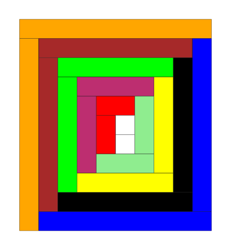
Since it may actually have been Mrs. Cuisenaire who came up with the concept of rods, I drew a log cabin quilt section in virtual rods. The Gattegno in the title refers to Caleb Gattegno, the mid-century educator who popularized Cuisenaire’s work.
Should you too feel the need to have a virtual set of rods, here are some files you can play with in Inkscape (or any other SVG-aware editor):
rods.svg — A palette of horizontal and vertical rodsrods-quilt.svg – source for the header image
The colours might be a bit off reality, but they’re near enough. I found it helpful to set a grid snap in Inkscape to 1 cm so that you could get the rods to align easily. If you want to get really nerdy, here’s the PostScript source I used to create the rods: rods.ps. I think I finally got the hang of basic arrays in PostScript …
Creating this was in noway a means of me displacing getting round to doing my taxes this year, nosirree.
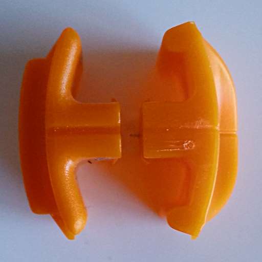
On the left, a very worn blade from a roughly decade-old Fiskars paper trimmer. On the right, one of the replacement blades you can get at Staples. Note the extra lugs stopping the new-style blades working with the old-style cutters? Bet they think they’re really clever little Fiskars for coming up with that planned obsolescence move.
It’s nothing that a steady hand and a rotary tool can’t fix, though …
After a relative lack of success in making cheap plotter pens, I managed to score a trove of old pens on eBay. Some of these were dry, and I tried to resuscitate them. A few came back to life, but I ended up with a handful of very dead pen shells.
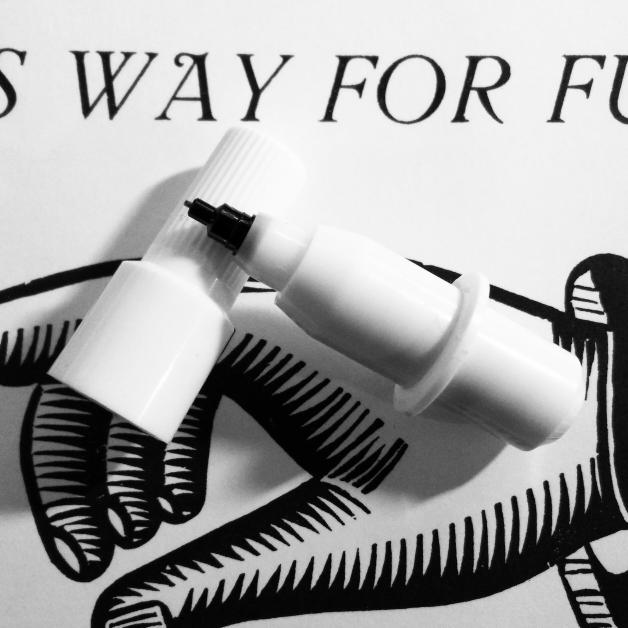
A dry plotter pen, possibly Alvin
I think the pens were made or sold by Alvin, as there were several empty Alvin trays in the batch I got on eBay. In taking one apart, I thought that a pen refill might just slide inside. Lo and behold, but didn’t the pen nerd’s fave gel pen du jour refill just slide in with enough of an interference fit that it wouldn’t easily slide back out.
Taking the dry pens apart isn’t too easy:
Pull the black tip straight out with pliers; it has a long fibre plug which goes into the ink reservoir. Discard the tip.
While it’s really hard to see, the other end of the pen body has a push-on plug. Gently working around it with a sharp knife can open it up a bit.
Once you’re inside the pen, pull the dry fibre ink reservoir out with tweezers and discard it.
Converting the pen body to use a Jetstream refill needs some tools:
Drill a hole in the plug at the end of the pen body just large enough to allow the end of the refill to pass through. It helps if this is mostly centred to keep the pen point centred; this is important for accurate plots.
Cut a piece of tubing just wide enough to slip over the pen refill, but not quite narrow enough to fit through the hole you just drilled. I used some unshrunk heatshrink tubing for this. It needs to be just long enough to push against the plug when the pen tip is at the right length. This should help stop the refill getting hammered back into the body by your plotter.
Before you assemble the pen, I find it useful to cut a couple of flats in the sides of the plug so you can more easily change the refill. You don’t have to do this, though.
Assemble the pen:
Push the Jetstream refill into the pen body, and adjust it so it sticks out about 6 mm clear of the plastic collar near the nib.
Put the tubing over the other end of the refill, and push the plug over the top, clicking it into place.
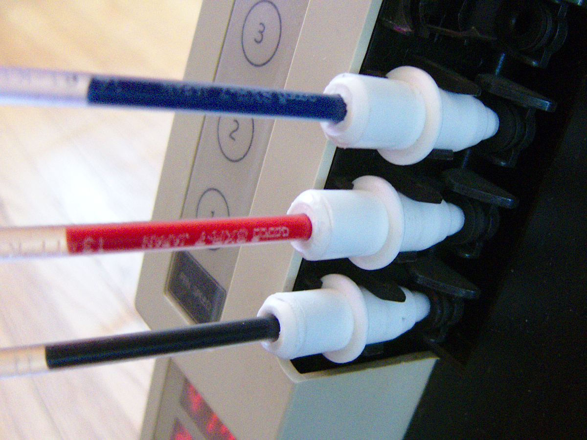
Three pens in place on my DXY-1300
To get best results, you’ll have to slow your plot speed down quite a bit. At standard speeds, you get a ¼ mm interrupted line which looks like this:
Jetstream at full speed
Close up, the lines are really faint
A hint that I should run them slower was at the start of each line, where the line would start very thick, then taper off as the ink supply ran low:
acceleration blobs
Run at 120 mm/s, the results where a bit darker, but still blobby at the start of lines:
120 mm/s
Slowing down to 60 mm/s produced slightly better results:
60 mm/s
But sharpest of all was at the crawling speed 30 mm/s:
30 mm/s
Some pronounced blobs at the starts of lines still. Here’s the full page at 600 dpi, squished into a very lossy PDF: jetstream_plotter-slow
The blobs could be due to this, though:
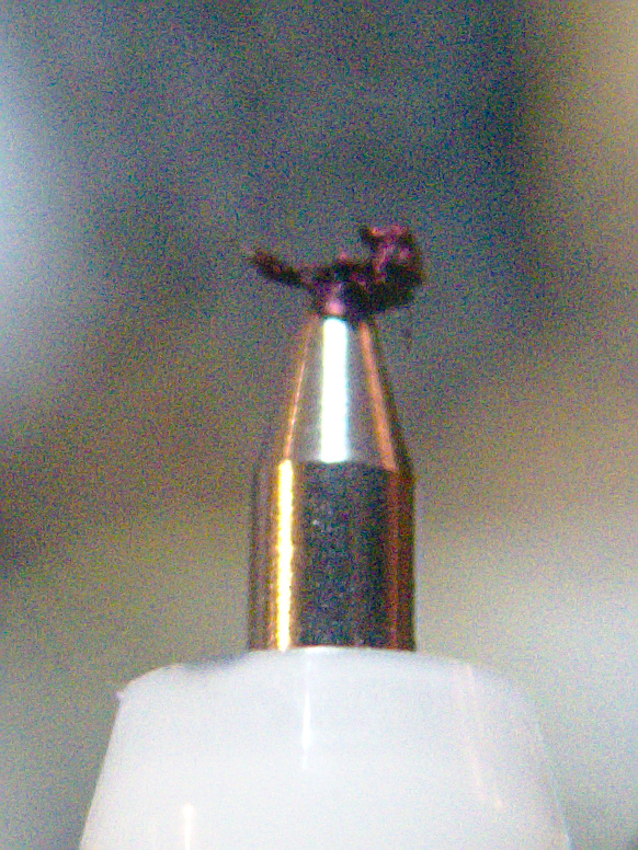
grode on pen tip
It seems that a mix of paper fibres and coagulated ink builds up on the tip. Occasional cleaning seems to be a good idea. It also seems to help to draw a quick scratch line before anything important so the ink will be flowing properly.
Just to sign off, here’s one of the pens in action:
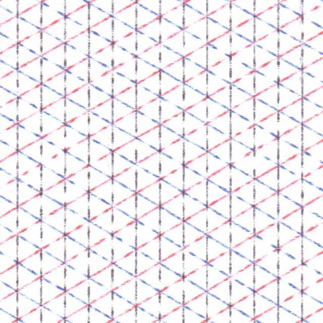
Inspired by Robert Howsare’s Drawing Apparatus, a time-step simulation of a similar apparatus was developed. Each trace was made of thousands of straight line segments, one for each rotation of the turntables’ drive motors, and enough to create a closed figure. Suitable gearing was modelled to simulate standard (North American) gramophone speeds of 16⅔, 33⅓, 45 and 78⅕ rpm for each of the turntables. Drive crank lengths were derived from standard record sizes. The initial starting angle of each turntable was also modelled.
Three simulation runs were chosen and superimposed. The result was plotted on “A” size vellum using 0.3 mm ceramic drafting pens. Total plot time at 90 mm/s: 22 minutes.
Code available on request.
(update, 2026: Code available on request if I can find it. I have implemented this project from scratch at least three different times because I forgot I’d done it before. You might say I’m forgetful, but I say I get 3× the joy of discovery this way …)
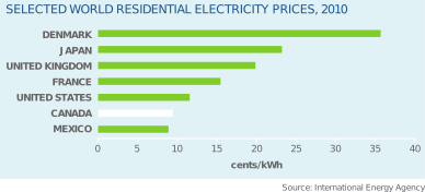
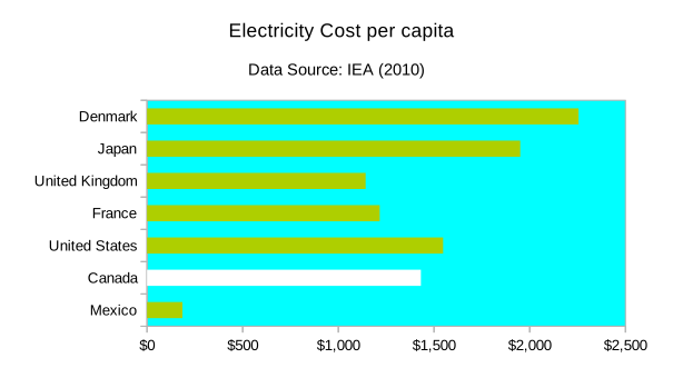
But as ever, hand-picked statistics only tell half the story. Digging into the IEA Key World Energy Statistics handbooks for 2011 and 2012, the data look something more like this:
Country
2010 Domestic Electricity Price / USD/kWh
2010 Annual Electricity Consumption per capita / kWh
Annual Cost per capita
Denmark
$0.356
6,329
$2,255
Japan
$0.232
8,399
$1,950
United Kingdom
$0.199
5,741
$1,142
France
$0.157
7,756
$1,216
United States
$0.116
13,361
$1,547
Canada
$0.095
15,145
$1,431
Mexico
$0.089
2,085
$185
So really, because Canadians use such an obscene amount of energy per capita (srsly; we should be ashamed of ourselves), the graph should look more like this:
So we’re not actually that inexpensive; solidly mid-range. Since our electricity price per kWh is so low, if we spent a little money on energy conservation, we could have really cheap power for everyone.