Hershey Complex font – works (mostly)

hershey sample
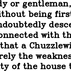
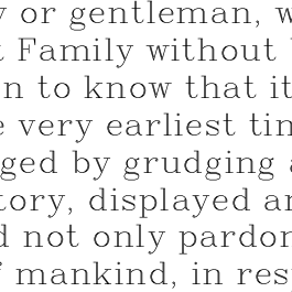
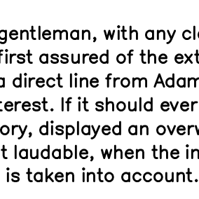
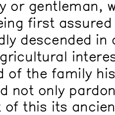
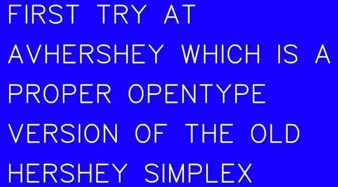
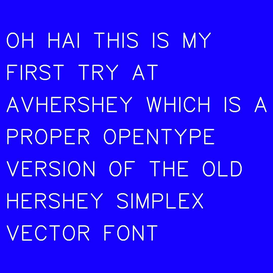
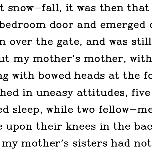
I’m pretty happy with this still-early version of AVHershey Complex Medium. There’s a PDF type sample embedded underneath the image. It’s from Augustus Carp, Esq., a book (and epub) that is now really and truly in the public domain in Canada.

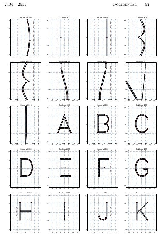
There’s still a lot to do. Even the regular Complex font (which has the best glyph coverage of all of the styles in the Hershey font collection) is needing more work:

  1. No pair kerning
  2. Weak currency character support; only $, when it really should have ¢, €, £ and ¥ too
  3. Not-very-complete Western European accents and regional characters
  4. Some frankly ropey decisions were made in filling in missing characters from composites/modifications of other glyphs.

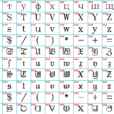
And now I’ve got to do the same for two other weights of Complex Roman — and then think about all the other variants! I’m not going to touch the Japanese glyphs, by the way; given how limited my knowledge of even Western typography, I doubt I’d be able to advance the representation of Kanji in any useful way.

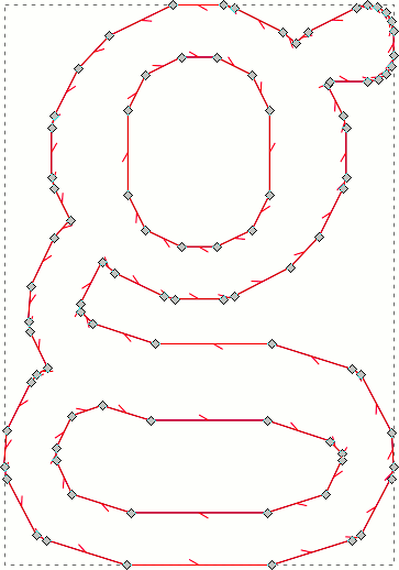
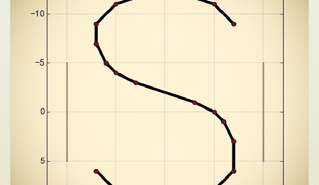
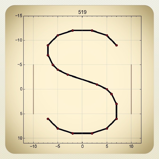
Considering that the glyphs are made up only of straight line segments, they look not bad in print. Sensitive typographers look away now; here are the control points for ‘g’:

ugh!
ugh!

Hershey Writes Again

Update: very preliminary OTF font files are available here: scruss/AVHershey-OTF. These don’t yet even encode all of ASCII, so aren’t yet generally useful.

Major breakthrough: yesterday (Feb 5th), I got the old Hershey fonts outlined properly, and today I have compiled them (sorta) into vector fonts. They’re not yet ready for release, as they have no metadata and are missing some key characters (even for ASCII).

I based the line thicknesses for the fonts as if I were drawing a 16 pt character, and using a plotter with a 0.3 mm (light), 0.7 mm (medium) and 1.0 mm (heavy) pen. You can see in the individual characters from the Hershey Complex font shown below, that the double hairline strokes merge into thicker single strokes. The same effect occurs on a real plotter, too:

S_AVHersheyComplexLightS_AVHersheyComplexMediumS_AVHersheyComplexHeavy

Here are some preliminary bitmap samples:

Complex Heavy
Complex Heavy
Complex Light
Complex Light
Complex Medium
Complex Medium
Simplex Heavy
Simplex Heavy
Simplex Light
Simplex Light
Simplex Medium
Simplex Medium

Progress on Hershey font outlines

Hershey Simplex says Hello

I still have lots of work to do, but at least now I can make buffered outlines of the 1967-vintage Hershey character glyphs into Fontforge-friendly vectors.

My goal is to release these as OTF fonts, rendered as it they’d been drawn by a constant line width pen plotter or film recorder, as was used in Dr Hershey’s day. Frank at Kiosk Fonts has loftier goals, and may actually release pretty fonts one day …

Precisely what nobody wanted — the Hershey fonts as a huge great PDF

HersheyNumberedOccidentalGrid-section

It’s impractically huge, but under the image link lives a table of all of the Hershey fonts (well, the Western ones, at least). It’s interesting to note Dr Hershey’s preferences in this pre-ASCII table: almost every variant has degree, minute and second symbols, but none of them have ‘\’. Many of them don’t have ‘@’, either, so no e-mail addresses in Hershey Fraktur for you …

Forgive me, A V Hershey …

I’ve been playing with the Hershey Fonts, vector data digitised by the US government in 1967. It’s in a bit of a bear of a format.

I hope to do more fun stuff with the data. For now, here’s an 120 page sample book showing all the characters:

hershey_sample_page