Richard gave me this book of logarithms, Dr Bruhns’ A new manual of logarithms to seven places of decimals. It had been lurking in his family library for decades. Just look at the layout!
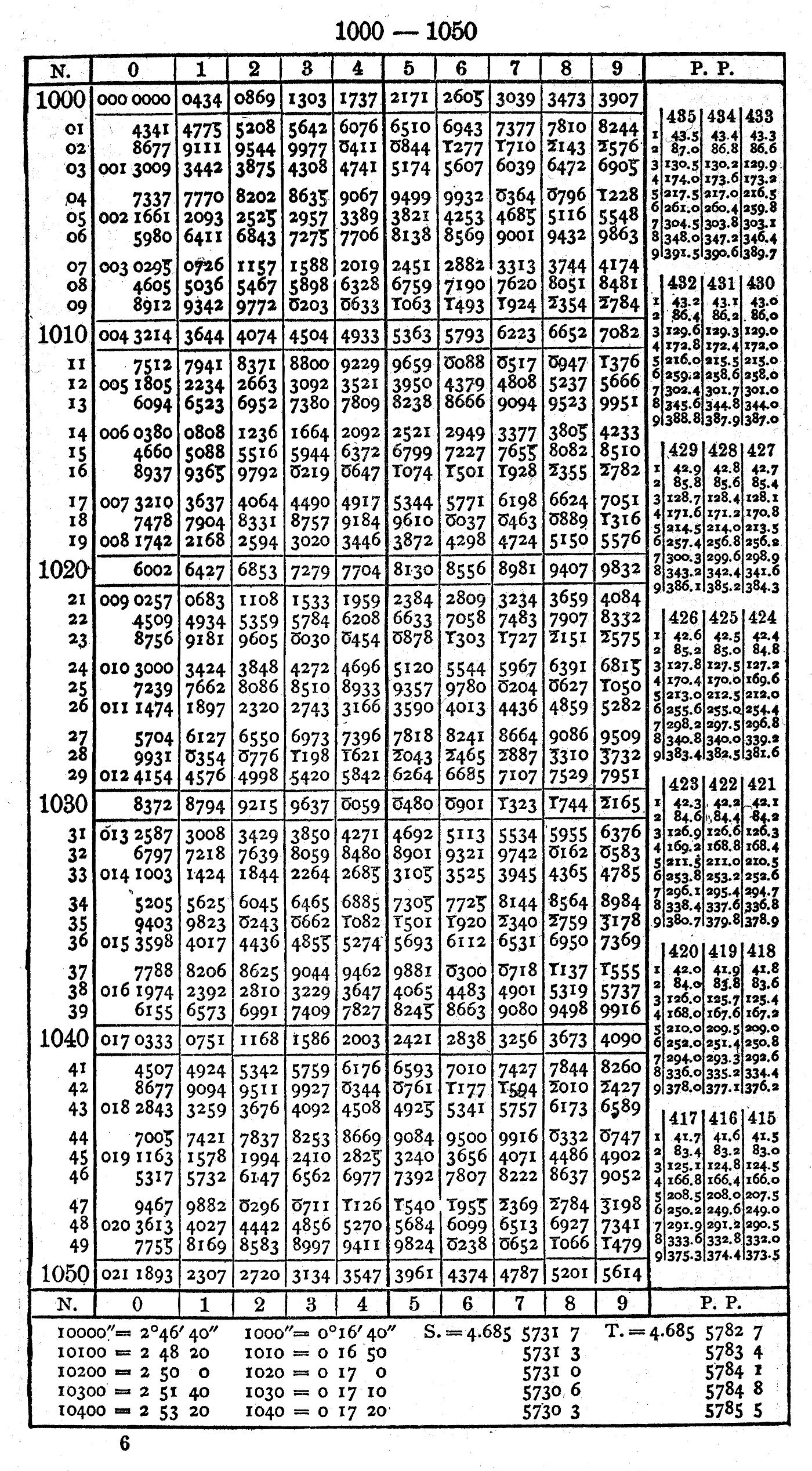 This is packing a ridiculous amount of information on the page. It’s dropping as many leading digits as it can: instead of showing log10 1001 as 3.0003431, it assumes you know the power of ten, leaves out leading zeroes, and shows it as ‘3431’. Another trick it uses to save space is printing logs of numbers less than one (which would be negative) as 10 + that logarithm. So log10 (1/ðœ‹) ≅ log10 (0.3183099) ≅ -0.4971499 would be represented by 9.5028501. You get the right significand, just the result is off by 10 orders of magnitude (since 10ð‘¥+10 = 10ð‘¥Ã—1010). I guess keeping track of the powers of ten was just considered mundane housekeeping.
Richard wondered why the book had Printed in Germany overstamped with Printed in USA:
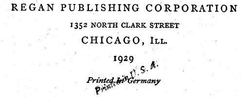 Given the date, it’s likely that it was printed from plates, rather than a photographic offset litho process. These plates were expensive to modify, so for a student reprint of a well-established textbook, it would have been cheaper to hand-stamp over the front page.
Because accuracy of reproduction is important for log tables, the many editions of Dr Bruhns’ tables were proud to be copied from printing plates so no new errors were introduced:
![]() Stereotyping was an old way of copying printing plates, first with papier maché, and later by electroplating/electrotyping. Because it was a cheap way of getting articles and pictures reproduced in newspapers, stereotype came to have its modern meaning. The word cliché also comes from the same process, as it was an onomatopoetic French word for the sound of molten casting metal hitting the papier maché mould.
Stereotyping was an old way of copying printing plates, first with papier maché, and later by electroplating/electrotyping. Because it was a cheap way of getting articles and pictures reproduced in newspapers, stereotype came to have its modern meaning. The word cliché also comes from the same process, as it was an onomatopoetic French word for the sound of molten casting metal hitting the papier maché mould.
There are many copies of this book in the Internet archive:
- A new manual of logarithms to seven places of decimals. 2nd sterotype ed.
- A new manual of logarithms to seven places of decimals. 3rd stereotype ed.
- Neues logarithmisch-trigonometrisches handbuch auf sieben decimalen (4th edition, German)
- A new manual of logarithms to seven places of decimals (7th edition)
- Nuovo manuale logaritmico-trigonometrico con sette decimali 11a ed. stereotypa (Italian)
Anyone want to check ’em for errors? There used to be a Prussian gold piece available if you found an error, but Prussia’s not returning our calls these days.
There’s one last surprise (or potential horror) in the book: a table of local definitions of the foot measure before metrication (and, since Dr Bruhns gotta bruhn, the logs of each number):
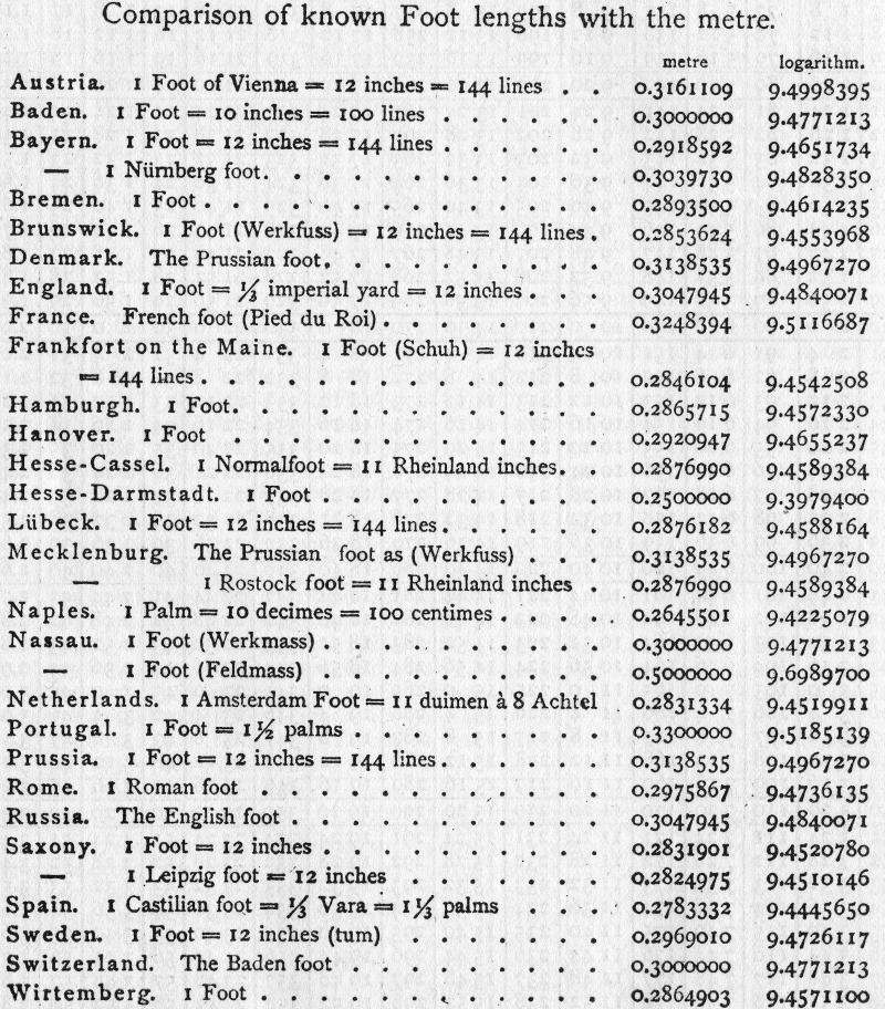 None of these are equal to the US customary foot, which is 0.3048 m precisely. The British and Russian foot are close, at 0.3047945 m. The US Survey foot isn’t represented either. Go on yourself, Mecklenburg and the Netherlands, with your plucky 11 inches to the foot (wat?). And I couldn’t leave you without a helpful instance of an obsolete measure symbol, the line, 1‴ (that’s U+2034) being 1/12″ or 2.116667 mm. Why code point space is being wasted on that and there isn’t a symbol for the wonderful HP plotter unit (1/40 mm, or 0.000025 m, which also happens to be the round[ish] 1/1016″) I will never know …