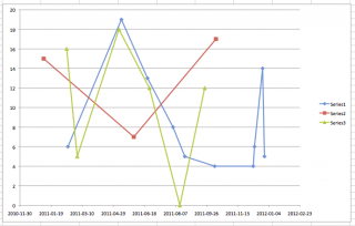
The Ask Metafilter question “Basic line graph” spurred me to make this unpretty graph:
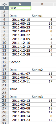
You need to make an X-Y (Scatter) plot. All others don’t have fully independent X-axes. Make your chart by selecting the first two data columns, then Insert Chart. Once the chart is in, right click/Control-click (OS X) to get this context menu:
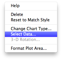
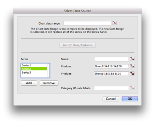
which should show
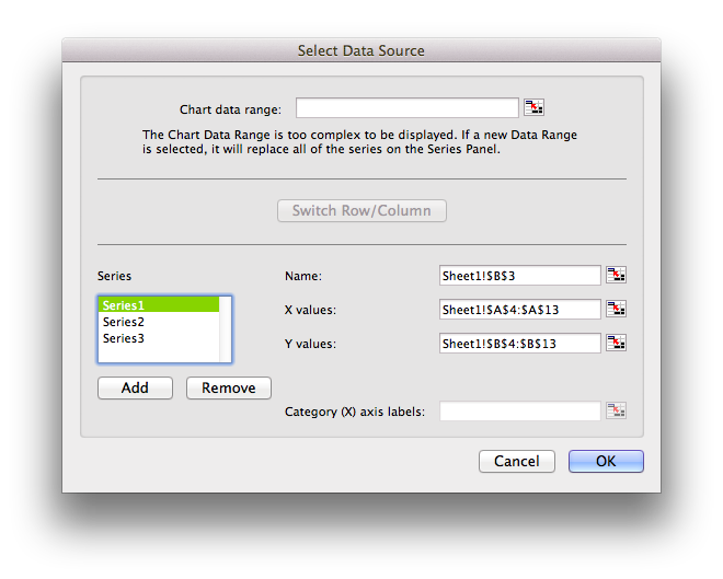
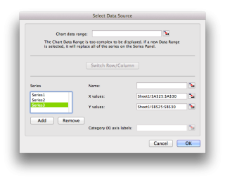
You can add more data series by hitting Add. Here are the specs for the next two series:
Finally, here’s the example spreadsheet: MultipleDateLinesChart.
