CBC says that Alberta’s looming multibillion-dollar orphan wells problem prompts auditor general probe. I mean, I’d say it does: estimated costs to clean up abandoned petrochemical wells outstrip the industry cleanup fund by over 132×, so it’s gone way past looming and is well into omnishambles country. But I’m not here to talk about the environmental mismanagement (well, not much: lolRedwater …), but more to talk about CBC’s terrible infographic:
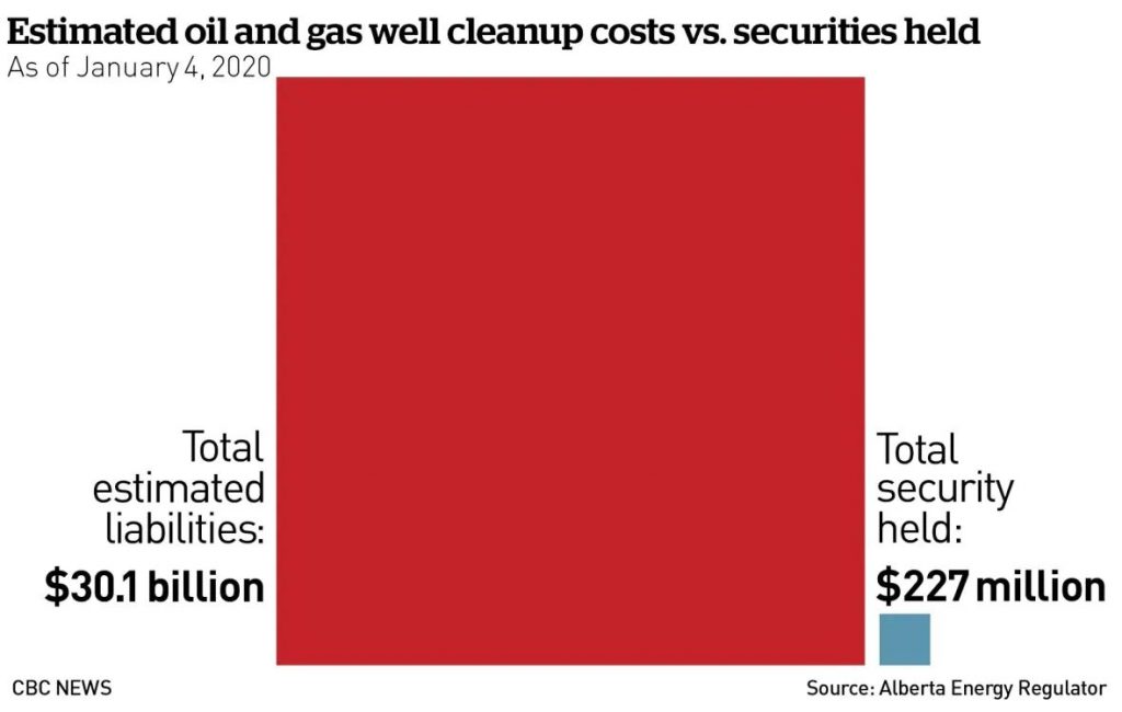
The image is accurate, technically. The estimated liabilities ($30100000000) are 132.6× the total security held ($227000000), and the red square’s length is 11½× (= √132.6) the blue one’s. But people are generally terrible at comparing areas.
Here are the same numbers, but in bar chart form:

(Graph badly put together by me in netpbm. Yes, netpbm …)
And there’s the problem: it’s too big to comprehend. CBC’s comfortable little chart fits on a page; you can tweet it, even. But reality is a whole lot of scrolling down the page.
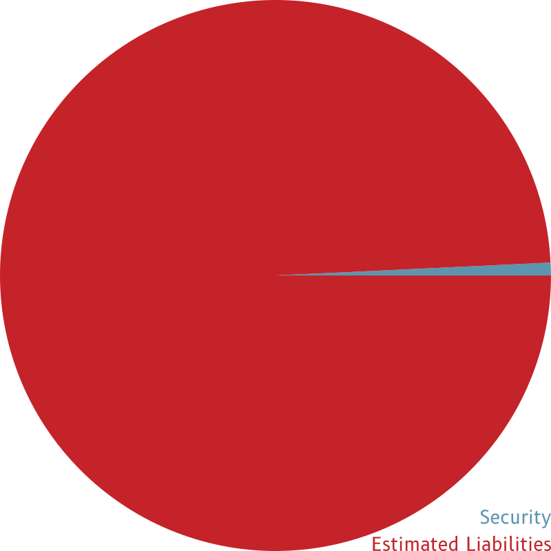
Even the manky old pie chart would be better than CBC’s squares-by area:
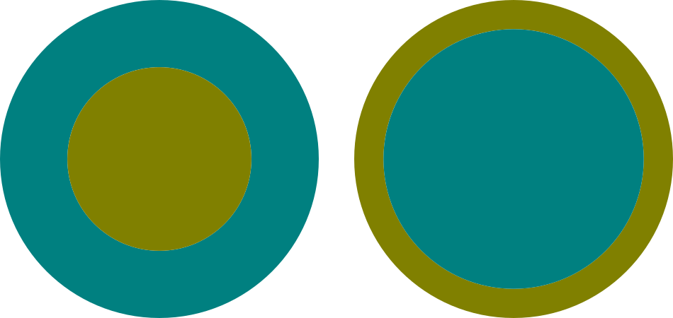
At least pie charts used linear measure as a proportion of the full 360° pie. But comparing areas is hard; in the diagram below, the teal-coloured part is twice the area of the gold part.
Leave a Reply