I’m only an amateur at information design, but I know bad information when it nearly causes me to miss my train.
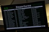
The above image (which links to a larger version) is one of GO Transit‘s new information screens at Union Station. It shows all outgoing bus and train traffic from Union Station for the next two hours or so.
What the used to have was a slightly mouldy old teletext system, where the screen was split roughly into three colour-coded segments: two segments about the next departing train on two different train lines, and the bottom third a big digital clock. You could read the time from across the GO concourse, so you could tell instantly if you had to run for the train.
This new display, you pretty much have to be underneath it to see the time. Also, if you’re a train commuter, you don’t want to know what happens in the next two hours. All you want to know is if you’ve missed your train. This is not an airport.
I know the old system left out bus passengers, but buses don’t exactly leave from the same concourse as the trains. They should have their own information board.

Leave a Reply