Some background: Headcrusher.
Instagram filter used: Lo-fi
Photo taken at: Commerce Court
NB: this is in the early stages of development, but does work. It’s by no means a plug-and-play solution. You’re going to have to do some coding, and perhaps some soldering. Undaunted? Read on …
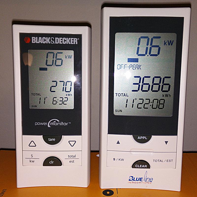
I really like the Blue Line Innovations PowerCost Monitorâ„¢ (aka the Black & Decker Power Monitor EM100B). I bought one long before the OPA started to give them away free to Ontario households as part of their peaksaver PLUS program. It’s a little device that clamps to your hydro meter and sends instantaneous power readings to a display.
Wouldn’t it be so much better if you could log and analyze these data? So a day’s power consumption might graph to something like this:
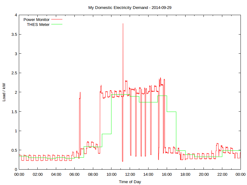 Yup, this is my real electricity consumption, as logged from the PowerCost Monitor. You can see the fridge cycling on and off, and I think the big mid-day spike was either the AC or the dryer; someone was home on that Monday. The rather blocky green line is Toronto Hydro’s hourly smart meter data. It really hasn’t got the resolution to show really detailed power use.
That spike at 06:30; what’s that? Let’s take a look:
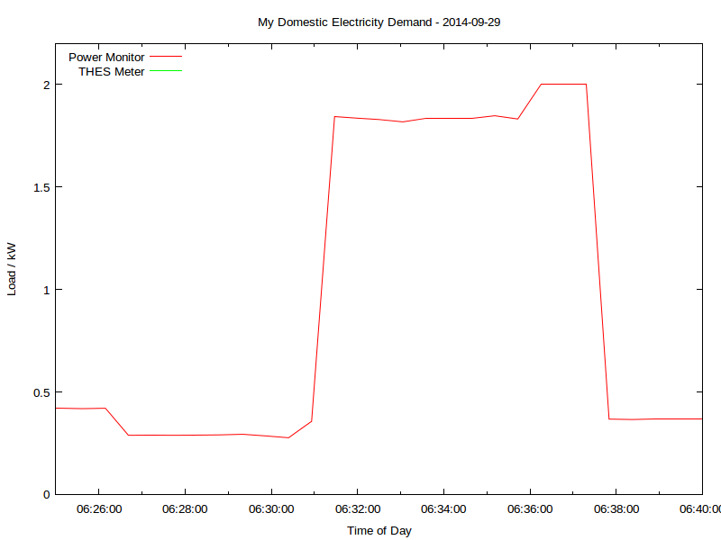 That’s me boiling the kettle. You can see that the time resolution is better than a minute, and the power is to the watt. Mmm, coffee …
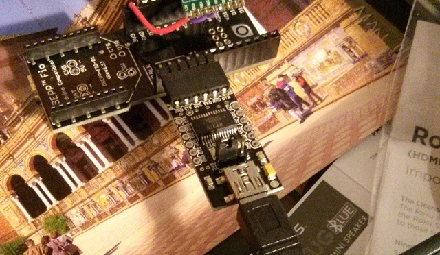
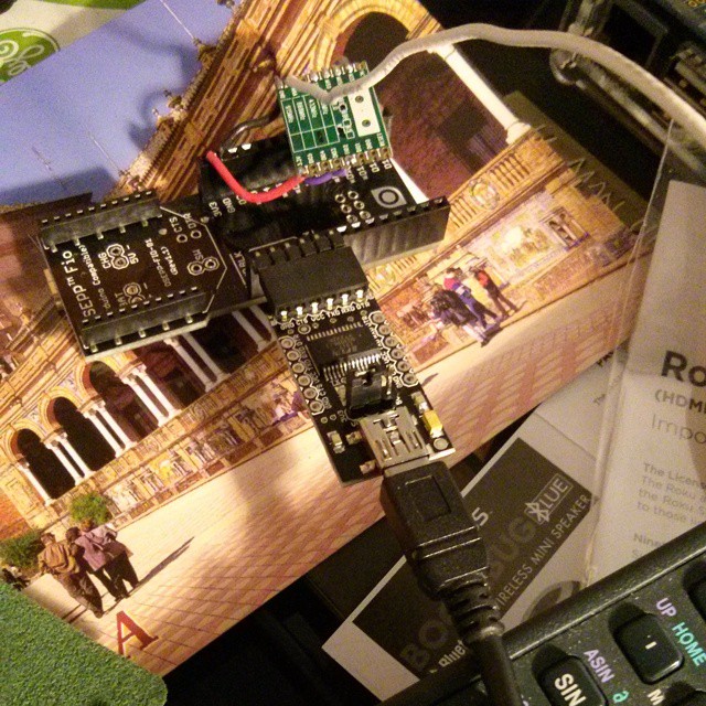
All of this is recorded using a simple Arduino-based solution, originally cooked up by Bryan Mayland. I’ve forked his code and added some instructions: scruss/Powermon433. Here’s the rig I’ve been using to log data over a USB serial link:
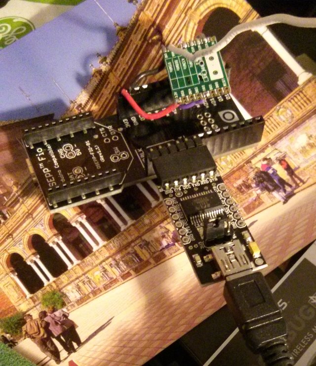
That’s a particularly ugly rig, due to the limitations of the 3.3 V receiver board I was using. There are other options that work with more normal Arduino boards up on github.
Here’s a sample of the data I’m logging, including the kettle incident:
| Datetime | Elapsed_s | Energy_Wh | Power_W | Temp_C |
| 2014-09-29T06:27:44 | 23241.7 | 25876 | 289 | 15 |
| 2014-09-29T06:28:16 | 23273.6 | 25876 | 290 | 15 |
| 2014-09-29T06:28:48 | 23305.5 | 25876 | 291 | 15 |
| 2014-09-29T06:29:20 | 23337.4 | 25892 | 294 | 15 |
| 2014-09-29T06:29:52 | 23369.2 | 25892 | 286 | 15 |
| 2014-09-29T06:30:24 | 23401.1 | 25892 | 277 | 15 |
| 2014-09-29T06:30:56 | 23433.0 | 25892 | 357 | 15 |
| 2014-09-29T06:31:28 | 23464.9 | 25892 | 1844 | 15 |
| 2014-09-29T06:32:00 | 23496.8 | 25892 | 1836 | 15 |
| 2014-09-29T06:32:31 | 23528.5 | 25952 | 1829 | 15 |
| 2014-09-29T06:33:03 | 23560.2 | 25952 | 1818 | 15 |
| 2014-09-29T06:33:35 | 23592.1 | 25952 | 1836 | 15 |
| 2014-09-29T06:34:07 | 23624.0 | 25952 | 1836 | 15 |
| 2014-09-29T06:34:39 | 23655.8 | 25952 | 1836 | 15 |
| 2014-09-29T06:35:11 | 23687.7 | 25952 | 1848 | 15 |
| 2014-09-29T06:35:43 | 23719.6 | 26048 | 1832 | 15 |
| 2014-09-29T06:36:15 | 23751.5 | 26048 | 2000 | 15 |
| 2014-09-29T06:36:46 | 23783.4 | 26048 | 2000 | 15 |
| 2014-09-29T06:37:18 | 23815.2 | 26048 | 2000 | 15 |
| 2014-09-29T06:37:50 | 23846.9 | 26048 | 368 | 15 |
You’ll see that I’m recording:
Compare that to the smart meter data:
| DateTime | Hour | KwhUsage | Cost | Rate |
| 2014-09-29 05:00:00 | 5 | 0.29 | $0.02 | $0.075 |
| 2014-09-29 06:00:00 | 6 | 0.31 | $0.02 | $0.075 |
| 2014-09-29 07:00:00 | 7 | 0.59 | $0.04 | $0.075 |
Not much data there, is there? Certainly not enough resolution to tell if a kettle has been running.
Even though this interface is homebrew and cheap, it is accurate. Here’s how four days of continuous readings stack up against Toronto Hydro’s meter:
| Â | Power Monitor | ndToronto Hydro Smart Meter | ||||
| Day | First Reading / Wh | Last Reading / Wh | Total Consumption / kWh | No of readings | Daily Total / kWh | No of readings |
| 2014-09-29 | 23896 | 43668 | 19.772 | 2711 | 19.77 | 24 |
| 2014-09-30 | 43668 | 52500 | 8.832 | 2710 | 8.82 | 24 |
| 2014-10-01 | 52500 | 68004 | 15.504 | 2711 | 15.51 | 24 |
| 2014-10-02 | 68004 | 81996 | 13.992 | 2712 | 13.99 | 24 |
The difference looks to me like aliasing; THES’s reporting is much more granular.
I’m going to develop this further to turn it into an easy (or at least, easier) to use logging platform. It’s taken us a few years to get here, but there’s nothing quite like a project finally working!


Instagram filter used: Lo-fi
Photo taken at: Postal Station K Toronto (Montgomery Tavern)


Instagram filter used: Normal
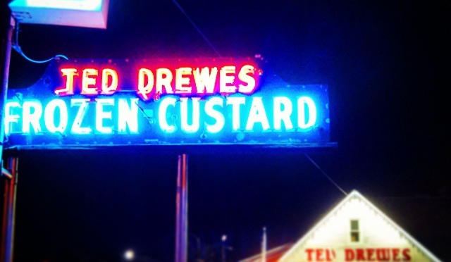
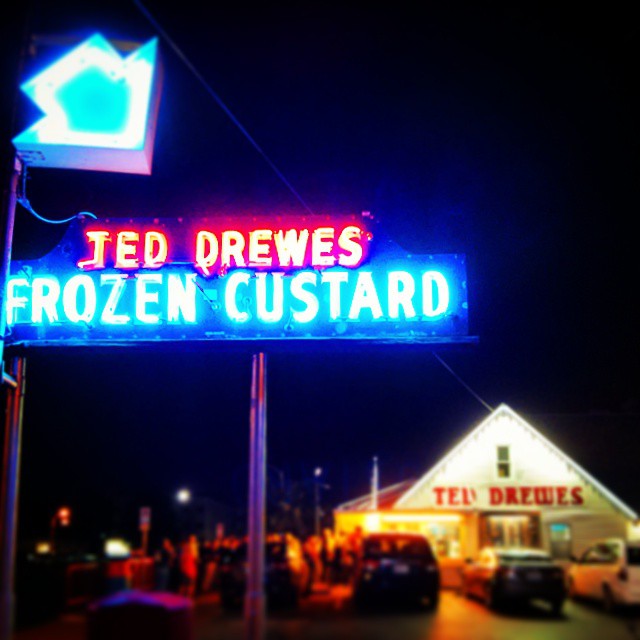
Photo taken at: Homewood Suites by Hilton St. Louis – Galleria
 I’m really impressed with darktable, a raw photo workflow for Linux. Unlike Gimp, it uses floating point for all image processes, so it doesn’t get caught up in quantization error. It’s a non-destructive editor, too: it assumes your source images are like negatives, and any changes you make are only applied to the exported images. Darktable also has a very intuitive black and white filtering mode (where you apply a virtual colour filter to the front of the lens, and see the results in real time) and some very powerful geotagging features. I’m sold.
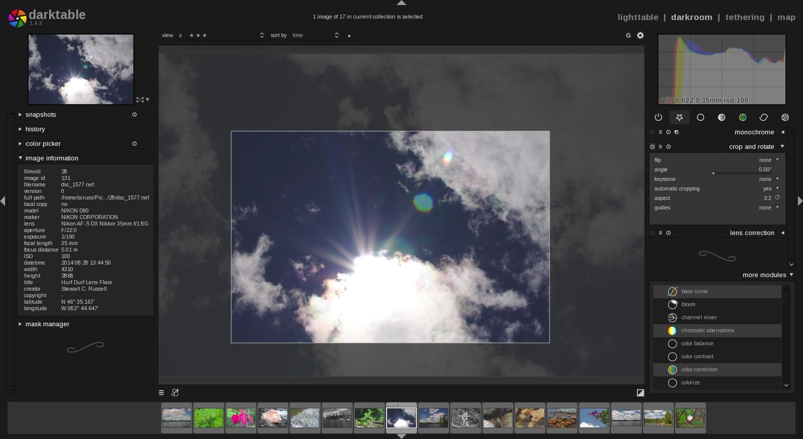 It’s not immediately obvious how some of the features work, and it took me a few hours (and some reading of the manual — eek!) to get files to export as I wanted them. It’s not quite perfect yet — the map feature can become unresponsive if you click too much on image icons — but it’s definitely solid enough for my purposes.
More of my initial darktable attempts on flickr: A Day by the Lake.