FifteenTwenty: Commodore 1520 plotter font

FifteenTwenty
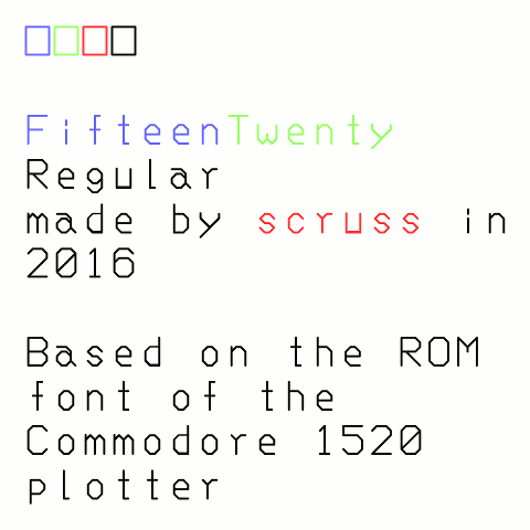
For the impatient: download FifteenTwenty-master.zip FifteenTwenty-Regular-OTF.zip (or more options …)
Updated: now with all ASCII glyphs!

Update, September 2016: this font was officially squee‘d over by Josh “cortex” Millard on the Metafilter Podcast #120: Hard Out There For A Nerd. I had the great pleasure of meeting Josh at XOXO 2016, too.

The Commodore 1520 was a tiny pen plotter sold for the Commodore 64 home computer. It looked like this:

Commodore 1520 printer plotter (adjusted).jpg
Commodore 1520 printer plotter — by Oguenther (Dr.Guenther). – This file was derived from Cbm1520-2.jpg: , Public Domain, https://commons.wikimedia.org/w/index.php?curid=39145769

I never owned one, but it seems it was more of a curiosity than a useful product.

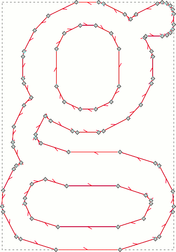
From a nerdy point of view, however, this device was rather clever in that it packed a whole plotter command language, including a usable font, into 2048 bytes of ROM. Nothing is that small any more.

Thanks to the epic efforts of Jim Brain and others, this ROM is now archived on Project 64 Reloaded. Looking at the code, I was struck by the elegance of the encoding: it packs a full X-Y plot instruction in one byte.

Based on my work with the Hershey font collection, I thought it would be fun to extract the coordinates and make a real OpenType font from these data. I’m sure others would sense the urgency in this task, too.

Since Commodore computers used a subset of ASCII, there’s a barely-usable set of characters in this first release. Notable missing characters include:

U+005C    \    REVERSE SOLIDUS
U+005E    ^    CIRCUMFLEX ACCENT
U+0060    `    GRAVE ACCENT
U+007B    {    LEFT CURLY BRACKET
U+007C    |    VERTICAL LINE
U+007D    }    RIGHT CURLY BRACKET
U+007E    ~    TILDE

I’ll get to those later, perhaps.

Huge thanks to all who helped get the data, and make the bits of software I used to make this outline font.

(Note: although the Project 64 Reloaded contains some extraction code to nominally produce an SVG font, it doesn’t work properly — and SVG fonts are pretty much dead anyway. I didn’t base any of my work on their Ruby code.)

Hershey Complex font – works (mostly)

hershey sampleI’m pretty happy with this still-early version of AVHershey Complex Medium. There’s a PDF type sample embedded underneath the image. It’s from Augustus Carp, Esq., a book (and epub) that is now really and truly in the public domain in Canada.

There’s still a lot to do. Even the regular Complex font (which has the best glyph coverage of all of the styles in the Hershey font collection) is needing more work:

  1. No pair kerning
  2. Weak currency character support; only $, when it really should have ¢, €, £ and ¥ too
  3. Not-very-complete Western European accents and regional characters
  4. Some frankly ropey decisions were made in filling in missing characters from composites/modifications of other glyphs.

And now I’ve got to do the same for two other weights of Complex Roman — and then think about all the other variants! I’m not going to touch the Japanese glyphs, by the way; given how limited my knowledge of even Western typography, I doubt I’d be able to advance the representation of Kanji in any useful way.

Considering that the glyphs are made up only of straight line segments, they look not bad in print. Sensitive typographers look away now; here are the control points for ‘g’:

ugh!
ugh!

Hershey Writes Again

Update: very preliminary OTF font files are available here: scruss/AVHershey-OTF. These don’t yet even encode all of ASCII, so aren’t yet generally useful.

Major breakthrough: yesterday (Feb 5th), I got the old Hershey fonts outlined properly, and today I have compiled them (sorta) into vector fonts. They’re not yet ready for release, as they have no metadata and are missing some key characters (even for ASCII).

I based the line thicknesses for the fonts as if I were drawing a 16 pt character, and using a plotter with a 0.3 mm (light), 0.7 mm (medium) and 1.0 mm (heavy) pen. You can see in the individual characters from the Hershey Complex font shown below, that the double hairline strokes merge into thicker single strokes. The same effect occurs on a real plotter, too:

S_AVHersheyComplexLightS_AVHersheyComplexMediumS_AVHersheyComplexHeavy

Here are some preliminary bitmap samples:

Complex Heavy
Complex Heavy
Complex Light
Complex Light
Complex Medium
Complex Medium
Simplex Heavy
Simplex Heavy
Simplex Light
Simplex Light
Simplex Medium
Simplex Medium

Progress on Hershey font outlines

Hershey Simplex says Hello

I still have lots of work to do, but at least now I can make buffered outlines of the 1967-vintage Hershey character glyphs into Fontforge-friendly vectors.

My goal is to release these as OTF fonts, rendered as it they’d been drawn by a constant line width pen plotter or film recorder, as was used in Dr Hershey’s day. Frank at Kiosk Fonts has loftier goals, and may actually release pretty fonts one day …

Gurney-7B

f7b-colour
A minimally-useful tracing of the standard numerals embossed
on credit cards. The geometry should be checked against ISO/IEC 7811—1:2002 should these data be used for official purposes. No claims of compliance are made here.

As there are only 10 digits in this font, encoding it as a digital
form (TTF, OTF, or otherwise) is left as an exercise for the reader.

Files

  1. f7b-colour.svg – an A4 sheet with all 10 digits presented as a
    poster. Each digit is approximately 1284% standard size.
  2. eps folder – PostScript source files. Each outline is approximately 5695% standard size, which is appropriate for a glyph in FontForge.

Workflow

The rough character outlines were created as short scripts in Python,
using the Shapely library to handle geometry. A confusing array of support tools (including, but not limited to: QCAD, wellknown
and OGR added the arcs and fillets. The more complex arc intersections were calculated using GeoGebra. Finally, the
outlines — at this point, mostly in the form of PostScript Level 2
arct commands — were hand-keyed into the EPS files included here.

Notes on the data

  1. There are some typos in the published coordinates, particularly in
    the “1” glyph. Whether these are genuine errors or
    trap streets‘, is hard to tell. The glyphs presented here are intended to be visually accurate
  2. The published coordinates of the “8” glyph indicate that it is
    only 97.6% as tall as the other digits. This has been carried
    through here.

Also on github: scruss/Gurney-7B

fixing firefox’s fugly fonts on Ubuntu

Update 2015-09: Better yet, install Infinality. It makes font rendering pretty.


Switching back to Linux from Mac is still a process of ironing out minor wrinkles. Take, for example, this abomination (enlarged to show texture):—

Screenshot from 2013-05-19 11:42:18

… No, I’m not talking about Mr Paul’s antics (or the typo in the TP post, either), but the horrid non-matching ligatures (‘attack’, ‘flubbed’, ‘targeting’) in a sea of blocky text. Almost every programme I was running had this problem. Mouse over the image to see how it could look if you apply this easy fix.

Create (or edit) the file ~/.fonts.conf ~/.config/fontconfig/conf.d, and add the following lines:

<match target="font" >
  <edit name="embeddedbitmap" mode="assign">
    <bool>false</bool>
  </edit>
</match>

Log out, log back in again, and text is properly pretty. Yay!